Blue Raster has always been a big fan of public transportation. Our office is strategically located across the street from the CourtHouse Metro stop. When the American Public Transportation Association (APTA) asked us to build a national map of public transportation for their members, we were excited to participate in their mission of ensuring public transportation accessibility to communities across the country.
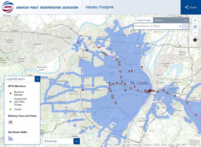
APTA set out to create an interactive map to provide their members with an advocacy and outreach tool to educate public and elected officials about the vital role of public transportation. With ArcGIS Online Accelerate solutions, Blue Raster built an interactive Industry Footprint map that leverages APTA’s ArcGIS Online subscription as their mapping and analysis tool. The map includes:
- APTA members
- public rail lines and stops
- bus stops buffered to 0.25 mi
- 2010 Census urbanized areas
- 113th Congressional districts
By using the map, users can view transit information localized to their community, as well as to the regional and national level.
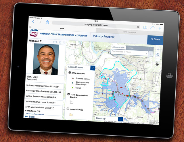
Several of the layers include custom information useful to APTA Members. This puts quick facts into the hands of APTA members, for example, the number of passenger miles traveled within a legislator’s district. Blue Raster integrated Sunlight Foundation’s Congress API v3 for complete and accurate congressional details.
Blue Raster queries a secure APTA member web service and geocodes addresses using Esri’s ArcGIS Online World Geocoder. The tool leverages the ArcGIS Online Portal API and server-side python tools to seamlessly integrate member geographic data.
The transit information is built from the General Transit Feed Specification (GTFS) data exchange. This specification defines a common format for public transportation schedules and associated geographic information. The GTFS data exchange is a site of “feeds” for public transit agencies to publish their data, and for developers to write applications that consume the data in an interoperable way. The result is a national layer of public transit in the Industry Footprint map. Learn more about GTFS by visiting the Yay Transit! website that breaks down a GTFS feed for the ArcGIS user.
Contact us today to learn how your organization can benefit from our ArcGIS Online Accelerate solutions.
- Posted in
- Transportation