Our Work

Blue Raster helps you tell your story through interactive
mapping technology. Make your message clear, exciting,
and user-friendly for both mobile and web platforms.

ArcGIS Dashboards

ArcGIS Monitor Maintains Healthy ArcGIS Enterprise for Collin County, TX

Blue Raster worked to deploy a well-architected ArcGIS Enterprise installation to support the growing GIS user base of Collin County, Texas. Just north of the Dallas – Fort Worth metropolitan area, Collin County has a rapidly growing population of over 1 million residents. With such a large and growing GIS practice to manage, the county looked to Blue Raster to install ArcGIS Monitor to aid in monitoring its GIS infrastructure and ensure that it stays up and running.

What is ArcGIS Monitor?

ArcGIS Monitor is a powerful tool from Esri that allows organizations to monitor the health of GIS infrastructure in real-time. It can help organizations identify and fix issues before they become major problems, saving time and money in the long run. This tool excels in:

  • Real-time monitoring of environments
  • Alerting and notifications for issues
  • Collection and analysis of performance data
  • Detailed resource utilization reporting
  • Monitoring of security events
  • Visualization of data in dashboards and reports

ArcGIS Monitor displaying performance metrics for Collin County's ArcGIS Enterprise

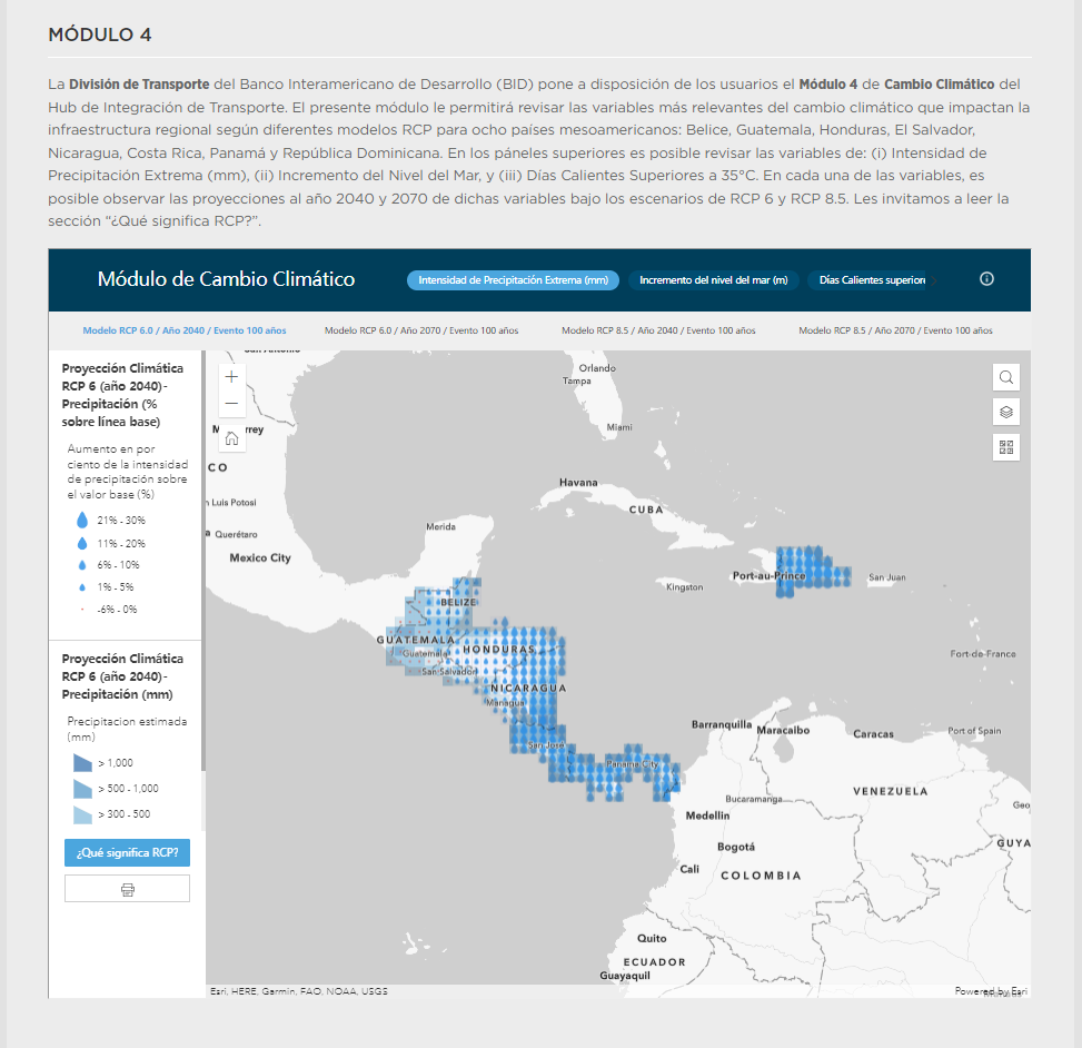
ArcGIS Monitor Provides Real-Time Performance Metrics for ArcGIS Enterprise

ArcGIS Monitor Helps Identify and Resolve Issues 

Blue Raster worked with Collin County to deploy a robust, well-architected installation of ArcGIS Enterprise 10.9.1 on-premises in 2022 and later added ArcGIS Monitor to maintain a healthy and stable environment. With Monitor, improved insights were apparent quickly with better visibility and quantification for issues related to Collin County's enterprise GIS. The tool saves time for GIS Supervisor Bret Fenster, providing a single location to monitor all components of ArcGIS Enterprise and make quick decisions based on real-time metrics.

"With ArcGIS Monitor, we’re able to assess the performance of our services and multi-server environment easily. Before we had Monitor, we had to RDP into each server to see exactly what was going on. Now, we can see CPU and RAM performance with one login and a well-crafted dashboard configured by our consultant, Blue Raster. "

- Bret Fenster, GIS Supervisor, Collin County

With improved visibility and insights into their ArcGIS Enterprise, Bret and his team were able to immediately address patterns they noticed with server performance and allocate more resources to the problem. The deeper level of metrics provided by ArcGIS Monitor helped Bret and team to address data and content governance with their internal customers, improving performance for all users of ArcGIS Enterprise.

ArcGIS Dashboard displaying metrics from ArcGIS Monitor

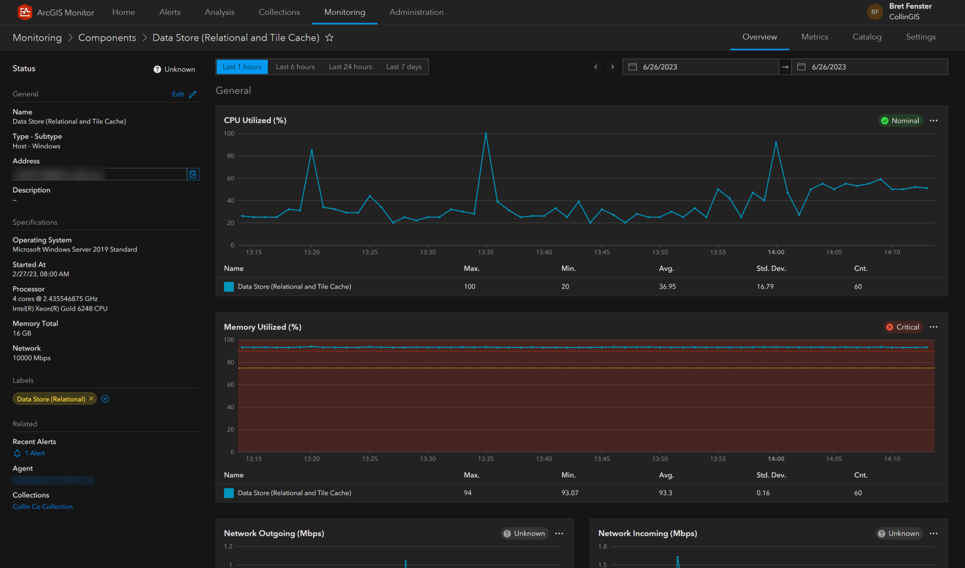
ArcGIS Monitor Displays Metrics Highlighting Need More Server Resources

"We’re able to determine where we need more resources immediately. For example, recently we noticed our hosting server began to consume more RAM (90%). We worked with our server team to get 12GB added to the VM. After the increase in RAM, the hosting server continued to use more RAM and motivated the team to look at ArcGIS Server manager and inventory the services. We noticed some new, unexpected layers published from our internal portal that were created by another team. We were able to contact that department and remove the services that were creating the impact and resolve the issue."

- Bret Fenster, GIS Supervisor, Collin County

ArcGIS Dashboard displaying metrics from ArcGIS Monitor

ArcGIS Monitor Displays Improved Performance of ArcGIS Enterprise after Increasing Server Resources & Addressing Data Publishing Governance

Is ArcGIS Monitor Right for You?

Collin County’s success with implementing ArcGIS Monitor for their ArcGIS Enterprise deployment demonstrates that the insights and resulting solutions stemming from the data collected and visualized provides value to the County’s GIS and IT teams. The ability to support observations with quantified metrics empowers Collin County’s team to maintain a performant enterprise GIS environment and reduce downtime. Blue Raster strongly recommends including Monitor in all new deployments of ArcGIS Enterprise or adding it to existing installations. If your organization would like better insights into your enterprise GIS environments, please explore our ArcGIS Monitor Page and Contact Us Today!

Contact Us Today!

Name(Required)
Email(Required)
Hi there! Need help with ArcGIS Enterprise in the cloud?

Creating Effective Disaster Preparedness, Response, and Recovery Resources for the Nevada Division of Emergency Management

In 2020, the State of Nevada’s Department of Public Safety began discussing the possibility of using Esri’s ArcGIS disaster response and damage assessment solutions to support emergency preparedness, response, and recovery more efficiently and effectively within its Division of Emergency Management (DEM). With Blue Raster’s extensive knowledge on these configurable solutions, Nevada’s DEM selected our team to partner together to build out the Preliminary Damage Assessment (PDA) Tool utilizing ArcGIS in Nevada’s specific environment.

NVDEM Damage Assessment

With the PDA Tool, Nevada’s DEM is able to:

  • Conduct initial damage assessments following natural disaster(s) or destructive event(s)
  • Capture the extent and severity of damage to property
  • Streamline evaluation of need for resources and acquisition of resources after disaster(s)
  • Aid emergency management
  • Collect damage reports
  • Perform initial assessments
  • Monitor the impact of disaster(s)
  • Provide critical information to stakeholders and the public

For the next few months, our team collected the necessary data to bring into the ArcGIS applications; configured and tested the disaster-management capabilities; and created several workflows in ArcGIS Online, ArcGIS Hub, Survey123, and ArcGIS Dashboards that would soon be presented to Nevada representatives from the state and local levels, as well as tribal lands.

To successfully build out the services Nevada DEM needed, our team also collaborated with Esri to secure the purchasing of Surge Licensing activated through Esri’s Disaster Response Program and requested through the State. With Surge Licensing, the division can request as many additional licenses as needed during the time of a disaster response without having to manage a large number of users on a day-to-day basis.

Nevada DEM’s PDA Tool utilizes:

  • ArcGIS Online to host and serve out content to the applications within the PDA Tool—including ArcGIS Dashboards, Survey123, and ArcGIS Hub
  • ArcGIS Dashboards to provide a comprehensive, at-a-glance view of the data and monitor trends
  • Survey123 so data can be collected via forms that are built into the tool; this includes operational surveys that can be accessed through the Damage Assessment Content group

ArcGIS Hub which offers a public site for county and local users and an internal destination for Nevada DEM; it also serves as a platform for connection and engagement between government entities and residents and promotes resources and data that are useful to the community

ArcGIS Experience Builder which is the configurable solution Blue Raster used to build the PDA Tool web application

In 2022, once the PDA Tool was in a good place, Nevada DEM brought in stakeholders—who were county officials, DEM employees, and local community and tribal leaders—so our team could deliver a series of trainings in their Emergency Operation Centers (EOC). Blue Raster GIS Analyst Andrew Patterson traveled to Carson City and Las Vegas to provide on-site, day-long trainings at the Nevada EOCs. These sessions included hands-on demonstrations, out-in-the-field practice, and thorough documentation so attendees could take what they learned during the training back to their communities and teach other people how to use this beneficial tool.

“Providing on-site training for Nevada DEM was a fantastic learning and teaching experience. I was able to work directly with the DEM’s GIS project manager and lead grants coordinator to provide day-long trainings at both the Carson City EOC and North Las Vegas City Hall. We used these trainings to not only showcase and teach the Preliminary Damage Assessment Tool but to also provide education on damage assessment best practices and its importance.” – Andrew Patterson, GIS Analyst, Blue Raster

NVDEM Training

Be Prepared in the Face of a Disaster

Blue Raster excels in creating fully operational emergency-management solutions. Interested in learning more? Contact us today to tell us more about your needs.

Building Bridges to Progress: The Inter-American Development Bank’s HIT Platform for Infrastructure and Transport

Across Latin America and the Caribbean, the Inter-American Development Bank (IDB) plays a pivotal role in financing sustainable, social, economic, and institutional development. With a mission to support transportation and infrastructure projects across South and Central America, the IDB collaborates with various partners to drive positive change in the region.

Blue Raster collaborated with the Inter-American Development Bank (IDB) to develop the Hub de Integracion y Transporte (HIT) Platform, a groundbreaking initiative that serves as a regional infrastructure and transport hub, consolidating and presenting crucial information layers for effective planning and decision-making.

IDB HIT Platform

The HIT Platform offers an innovative solution by providing a comprehensive platform that combines key information related to infrastructure, logistics, value chains, projects, climate change, Covid impacts, and development perspectives. This platform acts as a powerful planning tool and an invaluable information repository, catering to the needs of government officials, Mesoamerican stakeholders and IDB specialists. The HIT Project is divided into six modules, each utilizing the robust capabilities of the ArcGIS Online suite of solutions and incorporating custom-developed features to address specific requirements. Recognizing the linguistic diversity of the region, all modules of the HIT Platform were developed in Spanish. The HIT Platform encompasses a series of interactive web applications and dashboards developed with ArcGIS Online and ArcGIS Dashboards.

IDB HIT Platform IDB HIT Platform

The HIT Platform offers a personalized user experience by incorporating customized list and pop-up elements. These interactive components allow users to access specific information related to infrastructure, logistics, and value chains conveniently. By tailoring the user interface to meet specific requirements, the platform enhances usability and efficiency. To enable intuitive data visualization, the HIT platform project utilizes data-driven symbology, a feature within ArcGIS, to dynamically represent information based on various attributes. ArcGIS Arcade expressions, a flexible scripting language within ArcGIS, are employed extensively throughout the HIT project to ensure accurate and consistent data cleaning and formatting. By leveraging Arcade expressions, the platform achieves seamless integration and harmonization of diverse datasets, enhancing data quality and reliability.

Through its effective utilization of ArcGIS Online and its suite of applications and customization options, the HIT Platform sets a benchmark for effective planning and information management in the region, fostering positive change and driving sustainable growth.

Saratoga County Launches Substance Use Surveillance Dashboard

Saratoga County Dashboard

Saratoga County officials have been determined to find a way to address and combat the opioid epidemic in Upstate New York. On February 7, 2023, the Saratoga County Department of Health launched a tool called the Substance Use Surveillance Dashboard to help enhance the county’s opioid education, prevention, treatment, and response efforts.

The near real-time resource consists of an easy-to-navigate dashboard that houses informative data for Saratoga County professionals in law enforcement, public health, and mental health, as well as community partners who focus on substance use support services.

From Vision to Reality: Building the Substance Use Surveillance Dashboard

Blue Raster worked with epidemiologists from the Saratoga County Department of Health to design and configure the dashboard. Through a series of learning sessions, our team took Saratoga County’s vision and visualization ideas and brought them to life. Built on the ArcGIS Platform, we utilized Python scripts to update the dashboard’s key metrics for overdoses—shown through various graphs, charts, and a map by zip code. The dashboard also displays a series of charts and tables illustrating the epidemic over the years and through demographic breakdowns.

The Powerful Impact of GIS

At Blue Raster, we introduce federal, state, and local government clients, as well as global organizations, to the power of maps and GIS products as a way to respond to some of the largest health issues we face today. Saratoga County’s Substance Use Surveillance Dashboard is now another resource for local officials across multiple departments to use to educate and prevent further opioid use, provide treatment, and respond to overdoses with real-time knowledge.

“The opioid epidemic has devastated communities throughout the U.S. and like national and state trends, heroin and fentanyl continue to be key drivers of overdose deaths in Saratoga County. This dashboard will provide critical information for the County to implement effective strategies and initiatives to mitigate the effects of the opioid epidemic in our communities and the Health and Human Services Committee remains focused on supporting our county departments in these efforts.”

- Supervisor Phil Barrett (Clifton Park), Chair of the Saratoga County Board of Supervisors Health and Human Services Committee

 *Source: https://www.saratogacountyny.gov/latest-news/

Building Out the ASEAN Biodiversity Dashboard: An Accessible, Hands-On Approach to Conservation Education

The ASEAN Member States (AMS) is an organization made up of 10 Southeast Asian states—including Brunei, Cambodia, Indonesia, Laos, Malaysia, Myanmar, the Philippines, Singapore, Thailand, and Vietnam. With a goal to enhance and increase the efficiency of major conservation efforts and prevent species extinction across the ASEAN Region, the ASEAN Centre for Biodiversity (ACB) partnered with NatureServe—a nonprofit that provides biodiversity data to a plethora of conservation organizations—to create an interactive, online biodiversity dashboard.

This dashboard and map-centric tool would summarize and quantify the richness of ASEAN’s biodiversity while visualizing trends and geographic variation in biodiversity indicators used across the globe. The idea was to create a key resource for ASEAN stakeholders while being an open-source information application that would allow this important data to be accessible and understandable to everyone.

The Blueprint for Future Biodiversity Dashboards

NatureServe also wanted to take this dashboard a step further, with the idea to use the ASEAN Biodiversity Dashboard as a pilot for future dashboards that would visualize biodiversity data worldwide using global datasets. To kickstart this project, they reached out to Blue Raster to help display ASEAN’s biodiversity data in an informative, eye-catching, and interactive way with a set of dashboards and web applications.

1
Users can explore species occurrence, as well as their assigned IUCN Red List status, across the ASEAN region. In this example, species occurrence of reptiles is shown. Additionally, users can view other data such as protected areas. In this example, Protected Areas and Key Biodiversity Areas are visualized on the map-notice the widespread distribution of these areas across the region!

The Esri Technology that Made It Possible

In order to make the data come alive —which derived from the AMS, the ACB, and various global data sources—our team harnessed the capabilities of two ArcGIS Online applications, ArcGIS Dashboards and ArcGIS Experience Builder. It was important that we found solutions that would meet all of NatureServe’s criteria, and Esri’s web app, ArcGIS Experience Builder, did just that.

With Experience Builder coming out in late 2019 and Blue Raster kicking off our portion of the ASEAN Biodiversity Dashboard in July 2020, the dashboard was one of the first major projects our team worked on using Experience Builder. With an abundance of creative thinkers and an eagerness to push the limits of the web app, our team, led by Program Manager Phil Satlof, was able to customize more within the biodiversity dashboard using Experience Builder.

Working with the Data

NatureServe provided all of the data analysis, as well as their conservation expertise, while our responsibilities included the visualizations and determining how the data would be displayed on the web maps. Blue Raster GIS Analyst Sarah Aldama worked closely with NatureServe’s GIS analysts and application developers to build out the first set of dashboards and web maps– based on NatureServe’s vision and map metrics.

One primary focus for NatureServe was to visualize and map indicator trends, which led members of our team to build out the shell for the Indicator Trends tab within the ASEAN Biodiversity Dashboard. Some of the layers include the Bioclimatic Ecosystem Resilience Index, Forest Cover and Loss, the Protected Area Connectedness Index, and Protected Area Coverage of Key Biodiversity Areas. In addition to the Indicator Trends tab, Blue Raster also assisted with the Biodiversity Data tab.

This map shows the Biodiversity Habitat Index Annual Change rate from 2010 to 2015 at the country level. Users can also view the same data at the watershed level.

Collaborating for the Sake of Conservation

Working with NatureServe on this highly collaborative project from July until September 2020, our detailed work, valuable insight, and technical expertise helped the ASEAN Biodiversity Dashboard become one of the first web-based exploratory maps to view biodiversity data through this regional lens. With guidance from our team, NatureServe was able to learn how to use Experience Builder to increase the capabilities of the ASEAN Biodiversity Dashboard and create similar interactive, online platforms—like the Artic Biodiversity Dashboard.

You can explore the ASEAN Biodiversity Dashboard now at dashboard.aseanbiodiversity.org. To learn more about our dynamic web and mapping solutions, visit blueraster.com/who-we-are.


Page 1 of 2