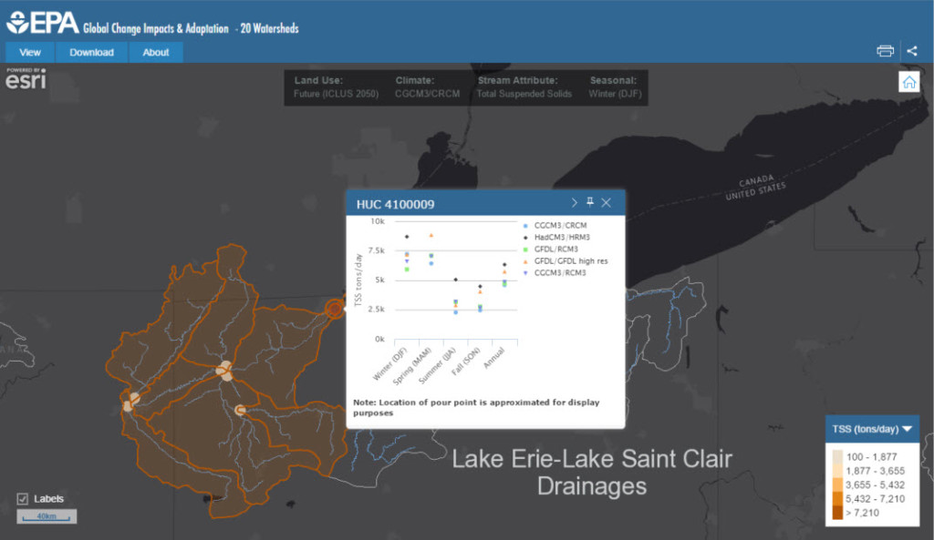
Blue Raster is proud to launch a completely redesigned Maryland Food System Map in partnership with Johns Hopkins University Center for a Livable Future (CLF). This new interactive mapping application enables users to visualize and download data on food and public health in Maryland, providing visibility into topics including agricultural production, food insecurity and locally-sourced food options. Users can explore the map to better understand geographic patterns and trends in their community, create their own map, or download data for their own research and planning.
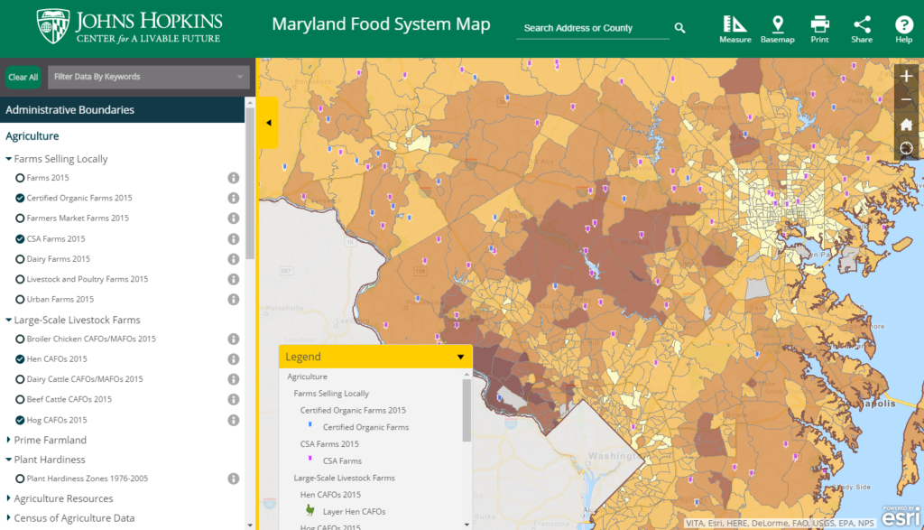
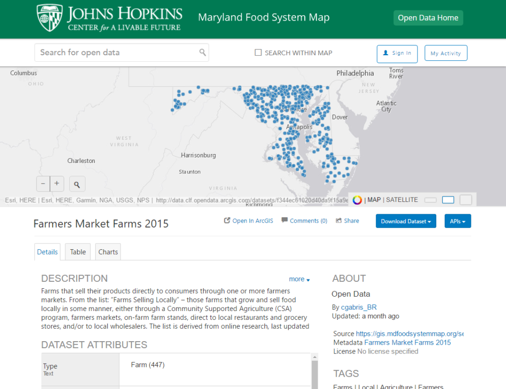
As part of this project, Blue Raster redesigned an existing application using modern JavaScript and HTML frameworks, upgraded the CLF data server, and optimized existing web services using Esri’s ArcGIS for Server to achieve a fast and responsive web experience. The new Maryland Food System Map is mobile, tablet, and user-friendly, and includes more than 175 data indicators that can be accessed and visualized with ease. Data are collected from a variety of sources, such as government databases, community organizations, and primary data collection and compilation. All data available on the site leverages the Center’s Esri Open Data Platform, where researchers and policy-makers throughout the state can search, view, and download data.
The application also has a number of new functions, including data filtering capabilities, and measure, search, and sharing tools. For example, users can build a map, zoom to a point of interest, and share the map they created through a unique URL. The map sharing tool enables users to post their maps on social media, or embed them on a website or blog.
“Maps can be powerful tools for generating insights into how food production, equity, access, and health are connected. We think that the new Maryland Food System Map will be a useful resource for anyone interested in learning more about local food systems—from community members, to students, food businesses, nonprofit organizations, and government officials. We are very excited that the new features will make it easier for people to explore and share information about our local food system, and we’re looking forward to seeing how these tools can help map the way to a healthier Maryland.””
– Caitlin Fisher, CLF Program Officer and manager of the Maryland Food System Map project
Be sure to check out the interactive mapping application today!
- Posted in
- Open Data
- ArcGIS for Server
- Nonprofit/NGO
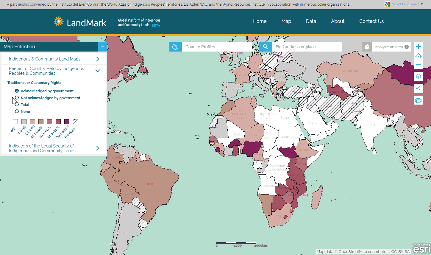
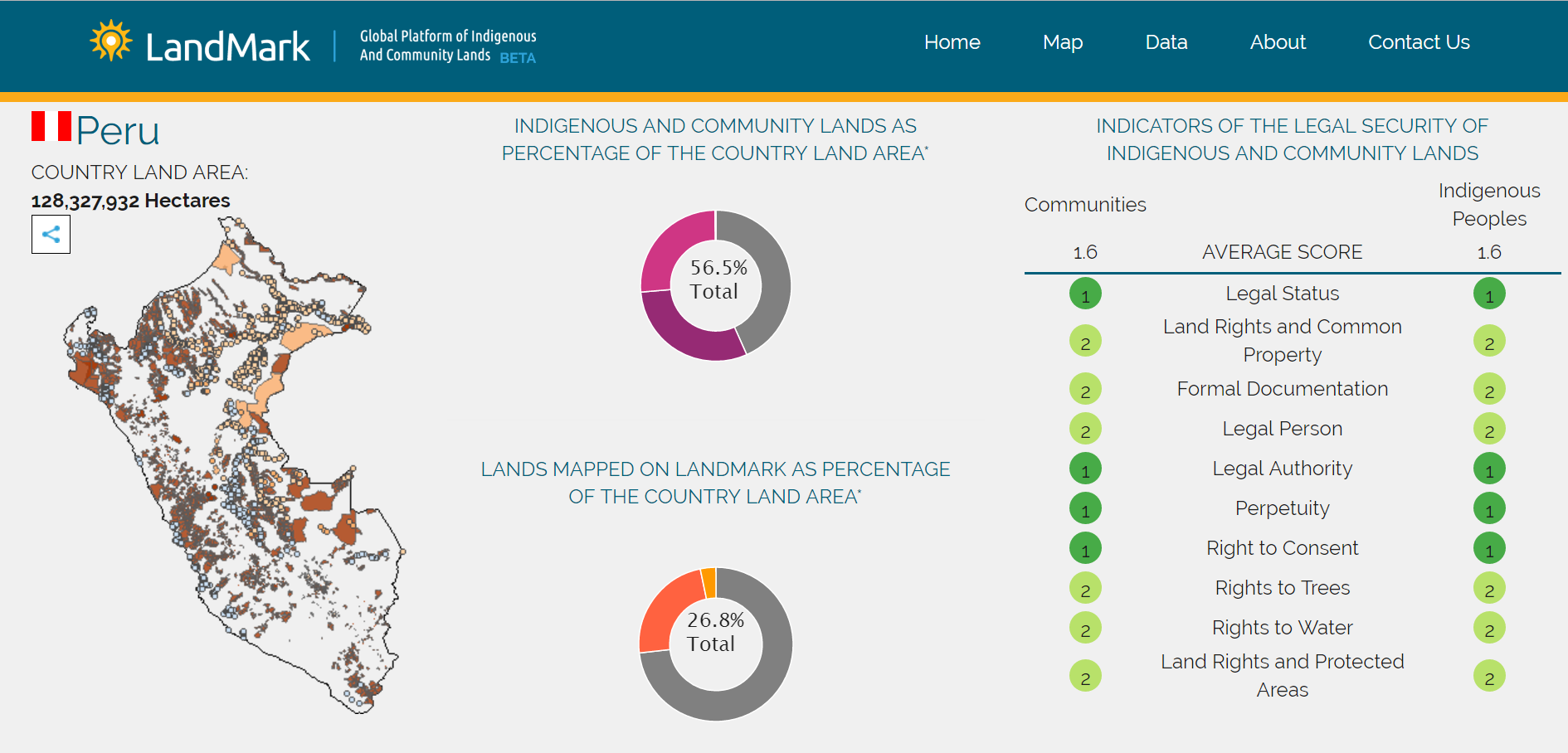
 “We are very pleased to continue working with Blue Raster from the inception of LandMark in 2014 through this latest development phase. Their support has been instrumental in helping us towards our goal of becoming the go-to site for information on indigenous and community land rights globally.”