You can find press releases everywhere. To increase the effect of an online press release, Blue Raster recommends including a story map, visually demonstrating the message with an approachable visual aid. Here is a recent example of enhancing a text-only announcement with the power of a story map.
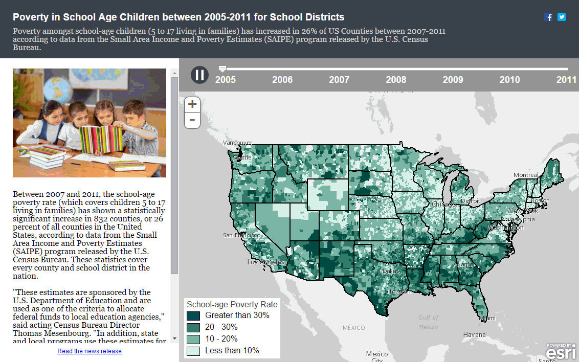
The U.S. Census Bureau recently released, Census Bureau Releases 2011 Income and Poverty Estimates for All Counties and School Districts. The Bureau found according to their own SAIPE data (Small Area Income and Poverty Estimates), between 2007 and 2011, the school-age poverty rate showed a statistically significant increase in 26 percent of all counties in the United States. Blue Raster immediately saw geography behind the story and mapped the percentage of school age children living in poverty across the nation (by school district) between 2005-2011 and published the data in an ArcGIS Online web map.
This SAIPE story map helps illuminate the significant increases in poverty over the past few years through an approachable presentation. By automatically stepping through a time series of the poverty rates by district, the map provides visual complement to the Bureau’s findings – that school-age poverty rate has increased within 26% of US Counties between 2007-2011.
View the story map and see for yourself how an interactive data visualization can enhance your online offerings including press releases and other data announcements.
- Posted in
- Story Map