The ASEAN Member States (AMS) is an organization made up of 10 Southeast Asian states—including Brunei, Cambodia, Indonesia, Laos, Malaysia, Myanmar, the Philippines, Singapore, Thailand, and Vietnam. With a goal to enhance and increase the efficiency of major conservation efforts and prevent species extinction across the ASEAN Region, the ASEAN Centre for Biodiversity (ACB) partnered with NatureServe—a nonprofit that provides biodiversity data to a plethora of conservation organizations—to create an interactive, online biodiversity dashboard.
This dashboard and map-centric tool would summarize and quantify the richness of ASEAN’s biodiversity while visualizing trends and geographic variation in biodiversity indicators used across the globe. The idea was to create a key resource for ASEAN stakeholders while being an open-source information application that would allow this important data to be accessible and understandable to everyone.
The Blueprint for Future Biodiversity Dashboards
NatureServe also wanted to take this dashboard a step further, with the idea to use the ASEAN Biodiversity Dashboard as a pilot for future dashboards that would visualize biodiversity data worldwide using global datasets. To kickstart this project, they reached out to Blue Raster to help display ASEAN’s biodiversity data in an informative, eye-catching, and interactive way with a set of dashboards and web applications.


The Esri Technology that Made It Possible
In order to make the data come alive —which derived from the AMS, the ACB, and various global data sources—our team harnessed the capabilities of two ArcGIS Online applications, ArcGIS Dashboards and ArcGIS Experience Builder. It was important that we found solutions that would meet all of NatureServe’s criteria, and Esri’s web app, ArcGIS Experience Builder, did just that.
With Experience Builder coming out in late 2019 and Blue Raster kicking off our portion of the ASEAN Biodiversity Dashboard in July 2020, the dashboard was one of the first major projects our team worked on using Experience Builder. With an abundance of creative thinkers and an eagerness to push the limits of the web app, our team, led by Program Manager Phil Satlof, was able to customize more within the biodiversity dashboard using Experience Builder.
Working with the Data
NatureServe provided all of the data analysis, as well as their conservation expertise, while our responsibilities included the visualizations and determining how the data would be displayed on the web maps. Blue Raster GIS Analyst Sarah Aldama worked closely with NatureServe’s GIS analysts and application developers to build out the first set of dashboards and web maps– based on NatureServe’s vision and map metrics.
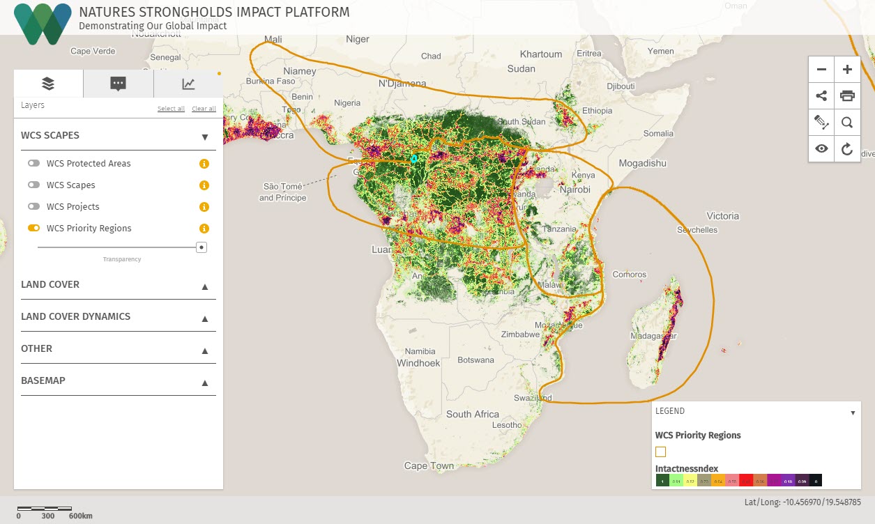
One primary focus for NatureServe was to visualize and map indicator trends, which led members of our team to build out the shell for the Indicator Trends tab within the ASEAN Biodiversity Dashboard. Some of the layers include the Bioclimatic Ecosystem Resilience Index, Forest Cover and Loss, the Protected Area Connectedness Index, and Protected Area Coverage of Key Biodiversity Areas. In addition to the Indicator Trends tab, Blue Raster also assisted with the Biodiversity Data tab.


Collaborating for the Sake of Conservation
Working with NatureServe on this highly collaborative project from July until September 2020, our detailed work, valuable insight, and technical expertise helped the ASEAN Biodiversity Dashboard become one of the first web-based exploratory maps to view biodiversity data through this regional lens. With guidance from our team, NatureServe was able to learn how to use Experience Builder to increase the capabilities of the ASEAN Biodiversity Dashboard and create similar interactive, online platforms—like the Artic Biodiversity Dashboard.
You can explore the ASEAN Biodiversity Dashboard now at dashboard.aseanbiodiversity.org. To learn more about our dynamic web and mapping solutions, visit blueraster.com/who-we-are.