Filter

Fires in Indonesia Park seen with GFW Fires App

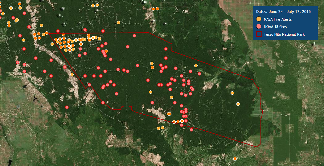
The World Resources Institute’s (WRI) Global Forest Watch Fires is currently being used to respond to a massive outbreak of fires in Tesso Nilo National Park, Indonesia. The fires in the protected area began May 29, 2015 and have continued to burn since.

In response, Blue Raster created the maps below using ArcGIS Online and a custom application to analyze the region where fires are burning. Using 50 centimeter resolution imagery along with NASA MODIS fire data, the maps capture the illegal activity occurring within the boundaries of this protected land. GFW Fires continues to be used as a response tool in Tesso Nilo and other parts of the world.

Check out the maps, and visit GFW Fires to see the latest on this outbreak.

Fires in Tesso Nilo National Park

Visualizing Open Data’s Global Reach

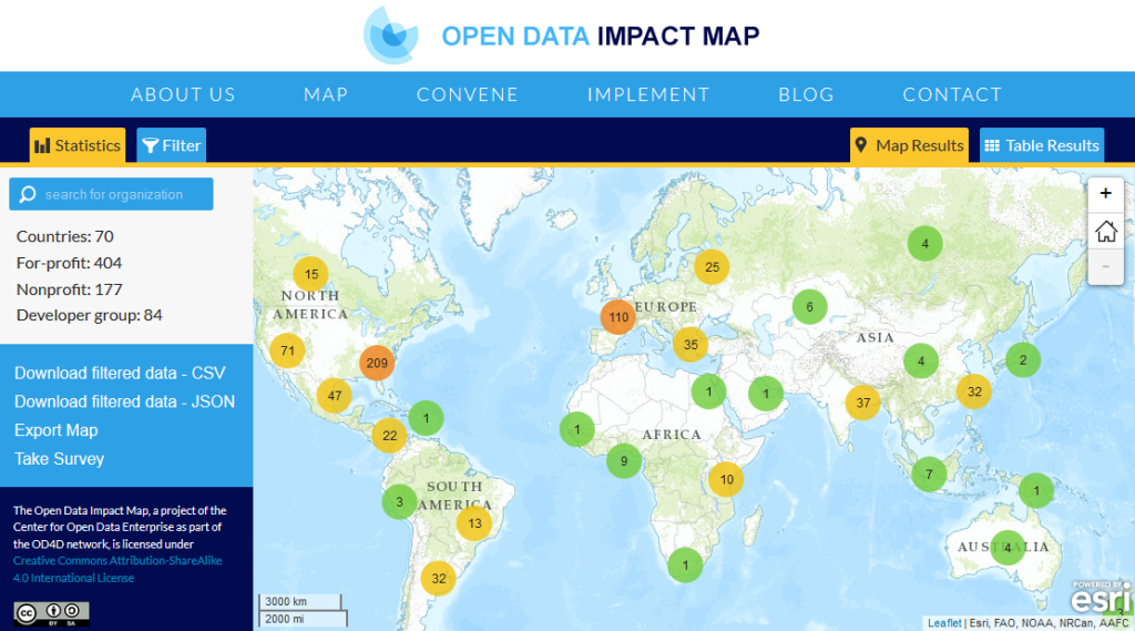
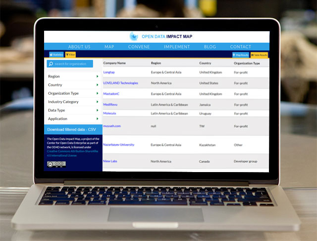
Blue Raster worked with the Center for Open Data Enterprise to build a mapping application showcasing a centralized, searchable database of organizations using open data worldwide. The Open Data Impact Map makes it possible to explore open data-use trends through filters and visualizations and facilitates comparative analysis by country, region, or company use of data. All information collected becomes publicly available as a resource for others to build on.

Open Data Enterprise Impact Map

The web map was developed in Leaflet using React, Backbone.js, Dojo, Modernizr, Underscore.js and jQuery javascript frameworks. ZURB Foundation was used as the web framework.


Joel Gurin, The Center for Open Data Enterprise

“All of us at the Center for Open Data Enterprise are pleased to have worked with Blue Raster on the Open Data Impact Map. Their engaging, user-friendly visualization will help make this an excellent  resource for the open-data community worldwide. We’re looking forward to continuing to work with Blue Raster…”

-Joel Gurin – President, The Center for Open Data Enterprise


Check out the site and see how dynamic clustering is used to visualize open data around the world.

Filter Table View

From Data to Decisions on Global Malnutrition

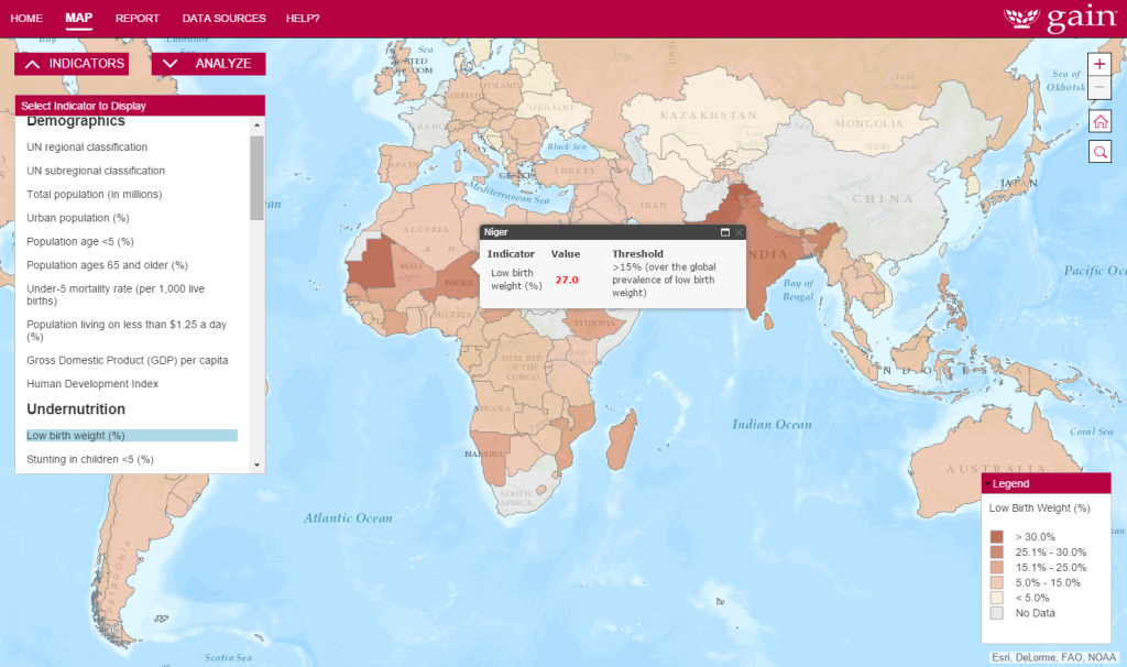
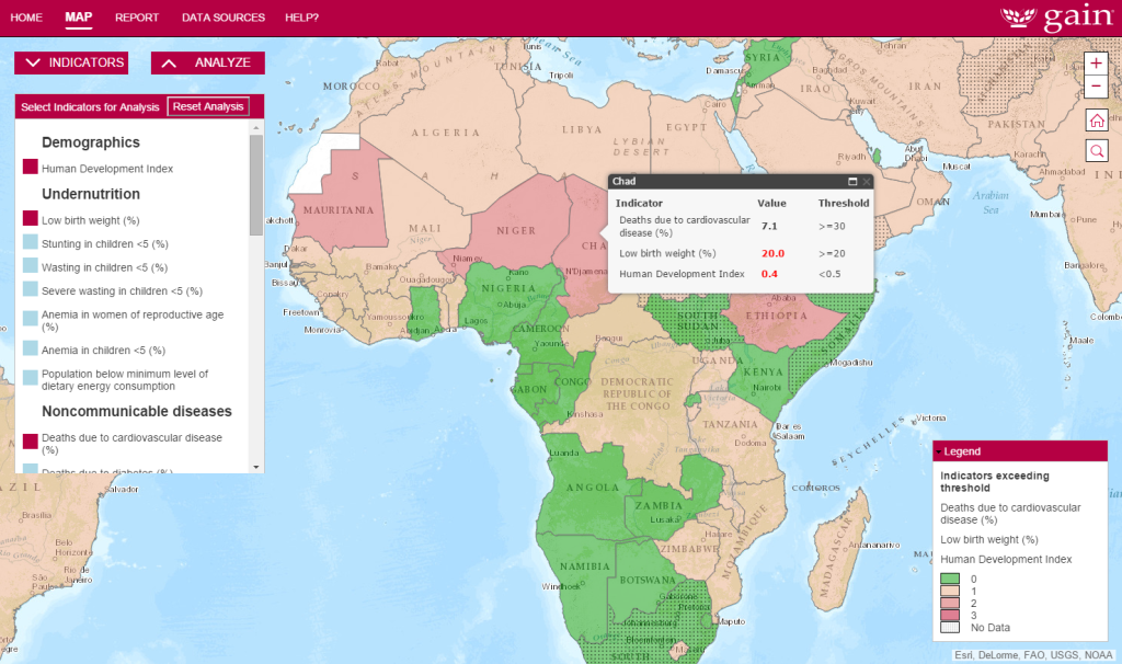
Blue Raster recently worked with the Global Alliance for Improved Nutrition (GAIN) to build a mapping application to highlight the multiple burdens of malnutrition in low, middle and high-income countries. This is a contribution to the growing research on the issue of the double/multiple burden of malnutrition globally. The interactive map transforms extensive tabular data from various resources into rich geographic visualizations, bringing the data to life in ways not possible in traditional reports.

Malnutrition Mapping Project

Intended as a policy and advocacy tool, the map allows users to analyze emerging issues and explore important indicators driving malnutrition. It provides country-level data and possibility to view the following:

  • Demographics
  • Undernutrition
  • Overweight / Obesity
  • Non-communicable diseases
  • Risk factors, and
  • Protective factors

Cloud-based ArcGIS Online powers the interactive mapping. For rapid performance, Blue Raster leveraged ArcGIS Desktop to symbolize and tile the data, and ArcGIS Online to host and serve the tiled layers and feature services. Users can explore and understand the underlying data by selecting multiple variables simultaneously and viewing countries exceeding thresholds or missing data.

Indicator Analysis in GAIN's Double Burden Map


GAINBlue Raster did an excellent job under a very tight timeline. Their responsiveness to our needs and their creativity exceeded our expectations. We are very excited to share this policy and advocacy tool with researchers and other stakeholders around the world.”
-Global Alliance for Improved Nutrition

GAIN’s mapping tool is helping deliver a better understanding of the burdens faced by countries suffering from malnutrition. It provides new geographic insight and analytical capabilities, and will lead to better decisions on how to help the most vulnerable of the global population. Visit the site, and see how Blue Raster helped GAIN move from static reports to a powerful advocacy tool.

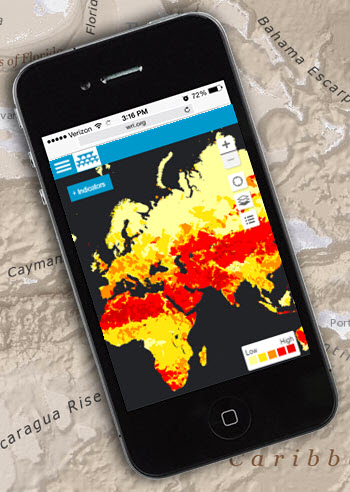
New Mobile-Friendly Water Risk Atlas

Aqueduct on Mobile PhoneEarlier today, Blue Raster and the World Resources Institute (WRI) released a new version of Aqueduct Atlas, an application helping companies and investors manage exposure to water risks. Launched in 2013, Aqueduct is used worldwide by leading companies, including McDonald’s, Goldman Sachs, and Procter & Gamble. For the first time, the site is optimized for mobile phones and tablets.

The new site enables users to:

  • Assess water stress, supply, and demand in the coming decades
  • Learn where water risks will be most severe under well-known climate scenarios
  • Prioritize investments for projected conditions

Charles Iceland, Director, Aqueduct Project “The World Resources Institute’s Aqueduct team has worked closely with Blue Raster for over three years developing the Aqueduct Water Risk Atlas. Blue Raster has been an invaluable partner in building innovative mapping tools to meet our target audiences’ needs.” 
-Charles Iceland, Director, Aqueduct Project


Features:

  • Global water risk maps
  • Weighing risk priorities:  scarcity, quality, prices, governance, and competition
  • Provides industry presets with sector-specific weighting schemes or define your own
  • Geocode facilities, suppliers, and potential new market locations
  • Export analysis results to Excel

Aqueduct is powered by ArcGIS for Server, ArcGIS JavaScript API, and ArcGIS Desktop. To learn more, visit the platform and see Aqueduct featured in the New York Times, The Guardian, Fast Company, Bloomberg, and Greenbiz.

APTA Story Map Amplifies Advocacy Message

APTA Story Map - Stand Up 4 Transportation

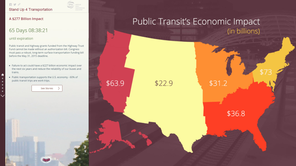
The American Public Transportation Association (APTA) asked Blue Raster to create a story map to spread their message. According to APTA, public transit saw its highest ridership in 58 years at 10.8 billion trips, but the current federal funding bill is set to expire on May 31, 2015.

Although a long-term transportation bill is supported by the transportation industry in near unanimity, APTA wanted a way to connect their message with constituents and to broadcast it out to a wide audience.

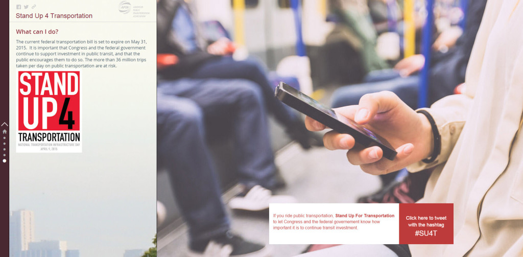
The Stand Up 4 Transportation story map features first-person narratives describing how public transit is impacting people in all parts of the country and sectors of the economy. The story map strategically launched in coordination with national Stand Up For Transportation Day on April 9th, a keystone event for showing national bill support.

Story from Minneapolis, MN

The map provides users with quick data visualization and offers information important at the community level including:

  • Transportation funding
  • Manufacturing Jobs
  • Rail and bus services

The ability to share the map on social media enabled APTA to amplify their message. Launching the application helped propel #SU4T on Twitter, Facebook, and other social media. By using maps, APTA was able to show the scale and impact of public transit, in a new way that text could not.

#SU4T

View the Stand Up 4 Transportation story map and see for yourself how your story can get in front of Congress and decision makers.


Page 49 of 66