The Tracking with Recency Assays to Control the Epidemic (TRACE) project is a new initiative that will contribute to the global fight to reach HIV epidemic control. With funding from the President’s Emergency Plan for AIDS Relief (PEPFAR) through the Centers for Disease Control and Prevention (CDC), TRACE is being implemented with technical assistance from ICAP at Columbia University’s Mailman School of Public Health and the University of California San Francisco (UCSF).

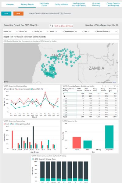
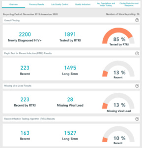
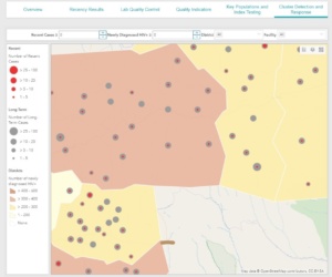
Blue Raster is developing a dashboard and map application to visualize, analyze and track the recent infections and identify hot spots where action may be directed. The dashboard application needs to be accessible and usable by many users in many scenarios. After assessing multiple options, the Blue Raster and TRACE teams decided on the ideal combination of Microsoft Power BI and Esri ArcGIS Online.
In the first year of the project, ICAP will support the roll-out of rapid recency testing in six countries in sub-Saharan Africa: Eswatini, Ethiopia, Lesotho, Rwanda, Tanzania, and Zimbabwe.
Through TRACE, new medical and technological innovations are combining in a powerful way:
Medical:
- TRACE is supporting select countries to begin implementing the use of Rapid Tests for Recent Infection (RTRI) which are capable of distinguishing between recent and long-term infections.
- The test can be completed in 20 minutes during a routine exam
Technological:
- Powerful, accessible and easy-to-use Business Intelligence platforms are in easy reach of public health organizations.
- The explosion in online GIS and mapping capabilities brings the ability to analyze and visualize data by geospatial attributes to the screens of more people than ever before.
Blue Raster is honored to support all efforts to reach HIV epidemic control through our work on projects like TRACE and the ICAP’s Population-based HIV Assessment (PHIA) project. Today’s availability of extensible, easy-to-use and cost-effective online tools will equip future generations with accurate and complete information about burden and distribution of disease. Furthermore, this will guide decision making to ensure that resources are efficiently allocated.
- Posted in
- Health
- ArcGIS Online
- Esri
- HIV
- Power BI
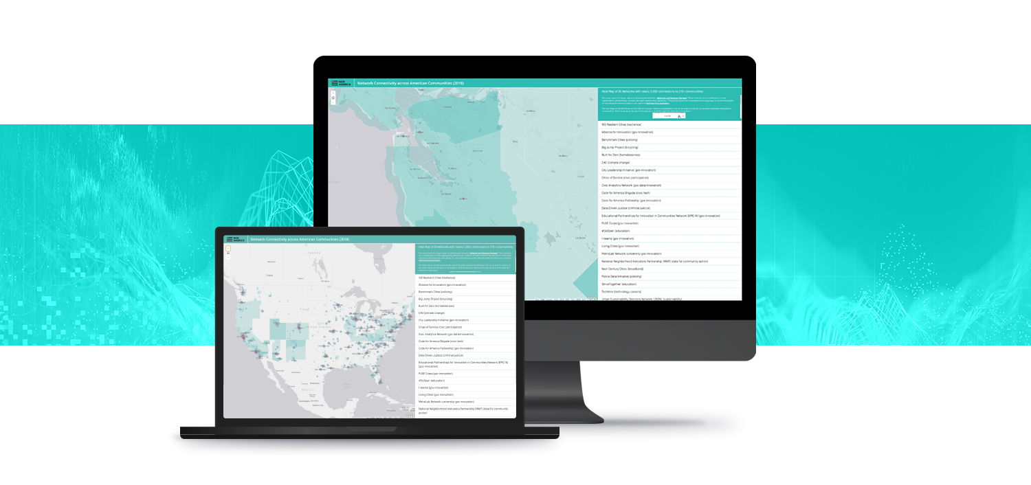
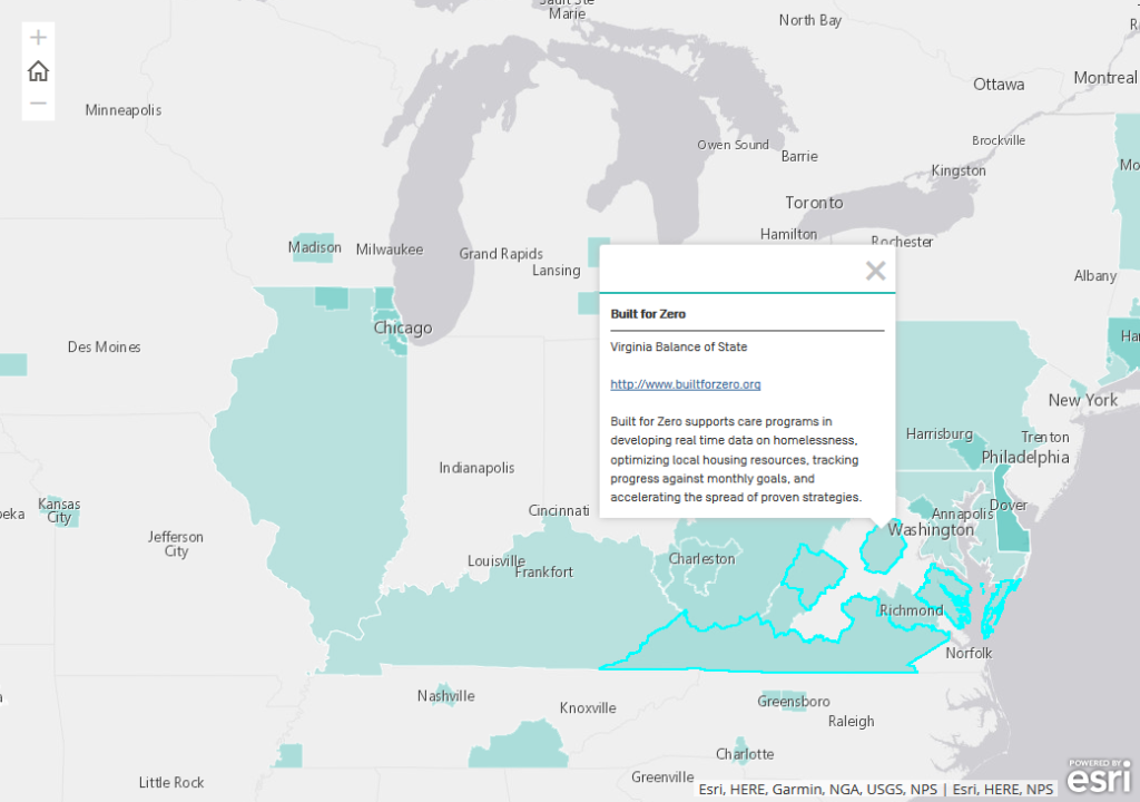 To visualize connectivity of both cities and communities simultaneously, the Blue Raster team used a combination of heat map cartography in addition to point and polygon data to show where overlaps occur between cities, communities, counties, and states.