Nonprofit/NGO

National Audubon Society’s Bird Migration Explorer

Introducing the National Audubon Society’s Migratory Bird Project: Bird Migration Explorer

Since 1905, the National Audubon Society has worked to protect birds and the places they depend on for survival through science, advocacy, education, and on-the-ground conservation. With over 500 chapters across the United States, the National Audubon Society is known by many for its impeccable and expansive conservation work.

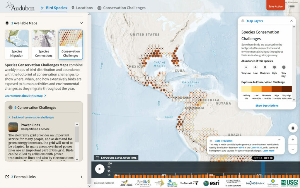
With the launch of its Bird Migration Explorer platform in September 2022, Audubon and its partners hope to teach users—including birders, conservationists, researchers, and even the general public—about the joys, complexities, and unique connections of migration. Through a partnership with Blue Raster, the platform tells the stories of migratory birds across the hemisphere, features mapping of over 450 species’ travels, and visualizes the conservation needs of high priority areas. Our team was able to help make this application a reality by configuring, publishing, and visualizing data from over 400 research studies.
Bird Migration Explorer

Exploring the Bird Migration Explorer’s Maps

Working with Postlight for all processing and publishing of datasets, and using Esri’s GIS software, Blue Raster was able to utilize ArcGIS Online to work with all of the given data and design the intricate and interactive maps within the digital Bird Migration Explorer experience.

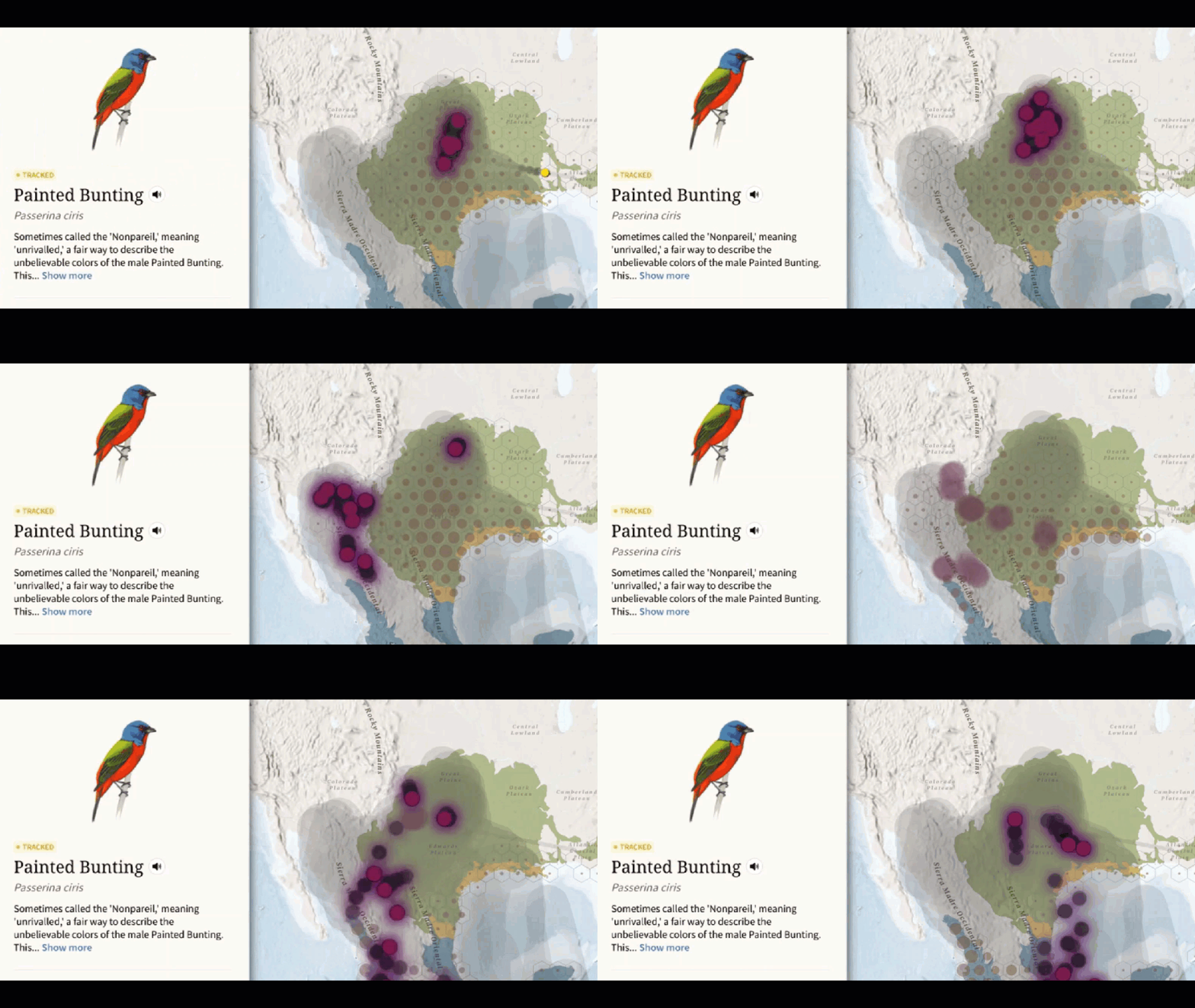
When the Explorer first opens, it prompts users to select a bird species. This opens the Species Migration Map, which displays the movement and migration of the selected bird throughout the hemisphere each year using real tracking data. With the precision of the tracking data being an important element to each bird’s journey, our team had to find a way to depict the accuracy of the technology used—such as GPS tagging or banding—to follow each species. Using purple dots for low precision and yellow dots for high precison, we were able to successfully illustrate the differences in tracking methods.

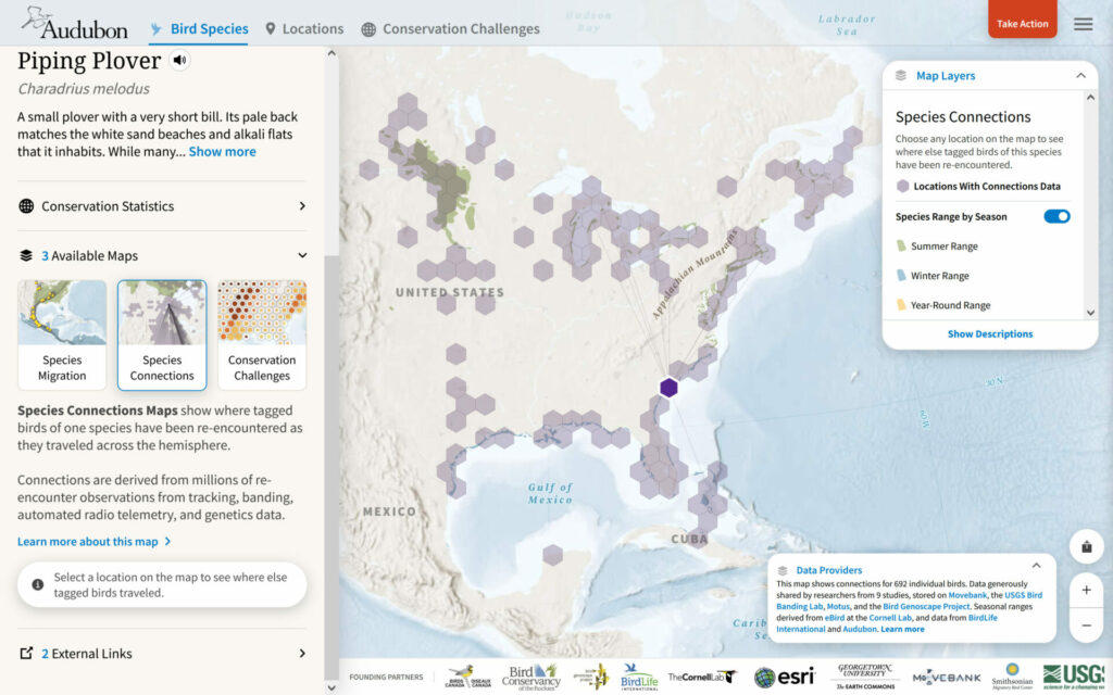
The Species Connections Map shows where tagged birds have been re-encountered as they travel across the hemisphere using tracking, banding, automated radio telemetry, and genetics data. The Conservation Challenges Map combines migration data with conservation challenges data to show where, when, and how birds are exposed to issues such as climate change, urbanization, pollution, and more throughout the year. We used time enabled data layers for the threat locations and the weekly location of the birds to showcase the most threating areas to each species during migration. This feature helps users understand their impact on the lives of these birds and how they can improve their journeys.
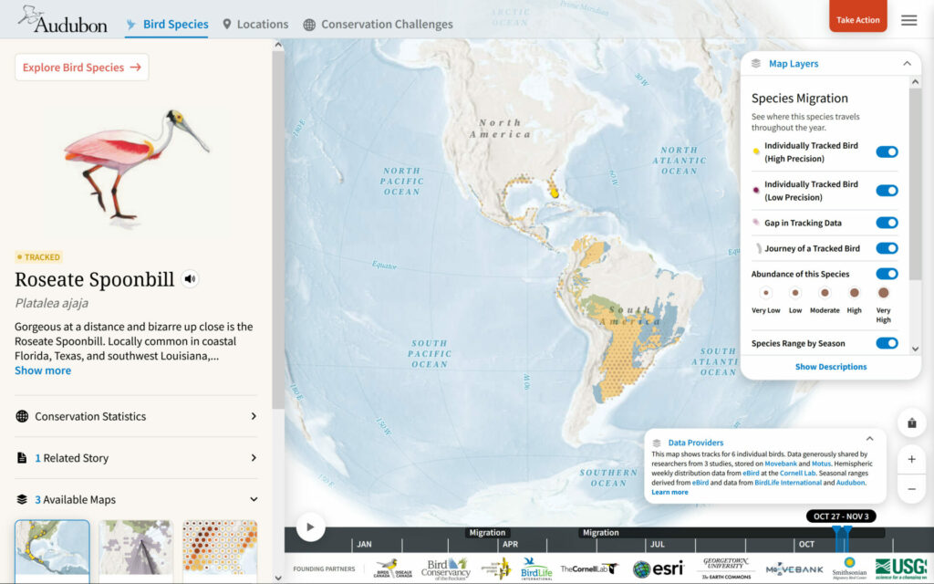
SpeciesMigration_MBI
SpeciesConnections_MBI
Bird Migration Explorer

How We Helped Audubon’s App Take Flight

Blue Raster configured this data in a PostgreSQL enterprise geodatabase, calculated connections using spatial joins, and set up automation processes using Python to publish and manage updates to these datasets. This system was used across all species migration, species connections, and conservation challenges datasets to generate the incredible mapping for the Bird Migration Explorer. We also created a scripting process for writing and formatting citations using the Zotero API which are applied to each dataset on ArcGIS Online.

Ready to experience the full annual migration for over 450 bird species? Check out Blue Raster’s work for the Bird Migration Explorer now!

Blue Raster Can Bring Your Story to Life

Contact us to learn more about this application or to see how interactive mapping technology could work for you.

National Fish and Wildlife Foundation Carbon Benefits Calculator

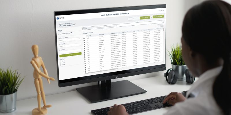
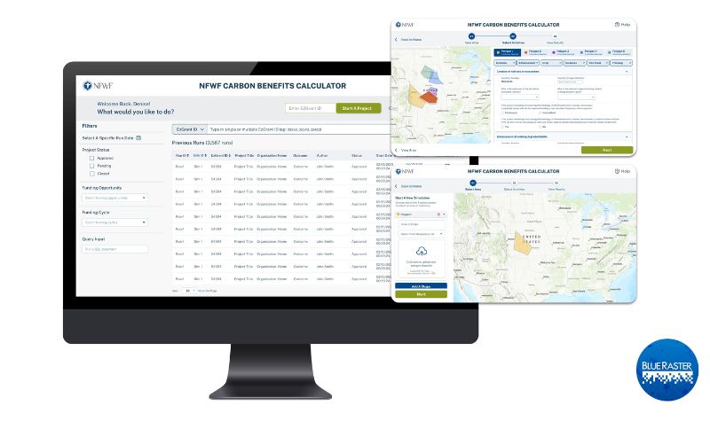
Most of our daily activities create greenhouse gas emissions which exacerbate climate change. Organizations like the National Fish and Wildlife Foundation (NFWF) spearhead efforts to mitigate these negative impacts by funding initiatives that offset emissions and create a greener earth. Blue Raster partnered with NFWF to create a robust Carbon Benefits Calculator. This tool estimates and visualizes the carbon impact of past and planned conservation efforts, restoration, and improved land management activities of NFWF.

NFWF Carbon Benefits Tool

NFWF wanted to innovate and optimize their existing in-house carbon calculator tool that was hosted in Excel. Blue Raster understands the need for a spatially explicit, robust tool that provides real-time calculations and eliminates hard-coded values to improve usability and usefulness. Additionally, this new tool enables NFWF to assess activities in various locations over different time series quickly and easily.

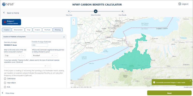
Our team created a web application backed by geoprocessing services in Python scripts. The tool allows a user to upload a spatial polygon for an area of interest to calculate carbon benefits, expanding the previous functionality that only allowed analysis at the county level. These calculations are done with python logic and geoprocessing services that are uploaded to ArcGIS Enterprise. Converting the tool from a spreadsheet-based calculator to a real-time and streamlined web application allowed for faster, easier, and more comparable results.

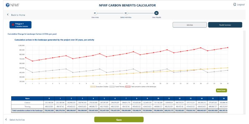
This tool uses various raster datasets including national land cover and carbon stocks to calculate the different properties and values such as climate, location, size, carbon stock, and land cover of the user submitted area of interest. Then, the tool automatically takes those values from the raster data and calculates the carbon benefits that would result from the selected project. NFWF can use this tool to estimate the carbon benefits of various projects and events such as invasive species clearing, crop and livestock use, thinning, fires, land transformations, over a 30-year period.

Previously, Blue Raster built out the Where We Work web map for NFWF to help illustrate the extensive geographic reach of their mission and impact of their conservation programs. Also, we built a proposal reviewer application and aided in NFWF's ArcGIS Enterprise installation.

We are excited to continue our collaborative efforts and work with a long-time partner by supporting NFWF with the Carbon Benefits Calculator and ongoing conservation efforts.

Ready to find out more?

We are excited to be a part of another non-profit's ongoing conservation and restoration efforts! Contact us today to learn how we can help your organization.

Non_Profit

Inspiring Children to Innovate for Success: The Henry Ford and the Innovation Atlas Explorer

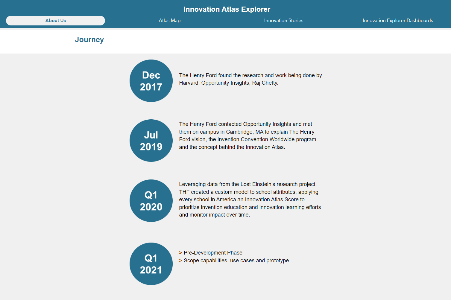
The Henry Ford (THF) in Dearborn, Michigan, is a force for inspiring tomorrow’s innovators.

When Jarell Brown, Head of Analytics and Business Intelligence for The Henry Ford, created the methodology for the Innovation Atlas Score he knew he would need a robust, configurable, and attractive platform for visualization and presentation. After contacting Emily Swenson from Esri, Jarell reached out to Blue Raster and a relationship was formed.

After gathering and processing data in ArcGIS Pro, Blue Raster advised THF to use Experience Builder for ArcGIS, combined with Dashboards for ArcGIS to build the Innovation Atlas Explorer.

According to THF, “The new defining feature of the success in our communities is not only upward mobility, but upward innovation as well – the aspiration that all children to have a chance innovate, no matter their background will create a more equal tomorrow.”

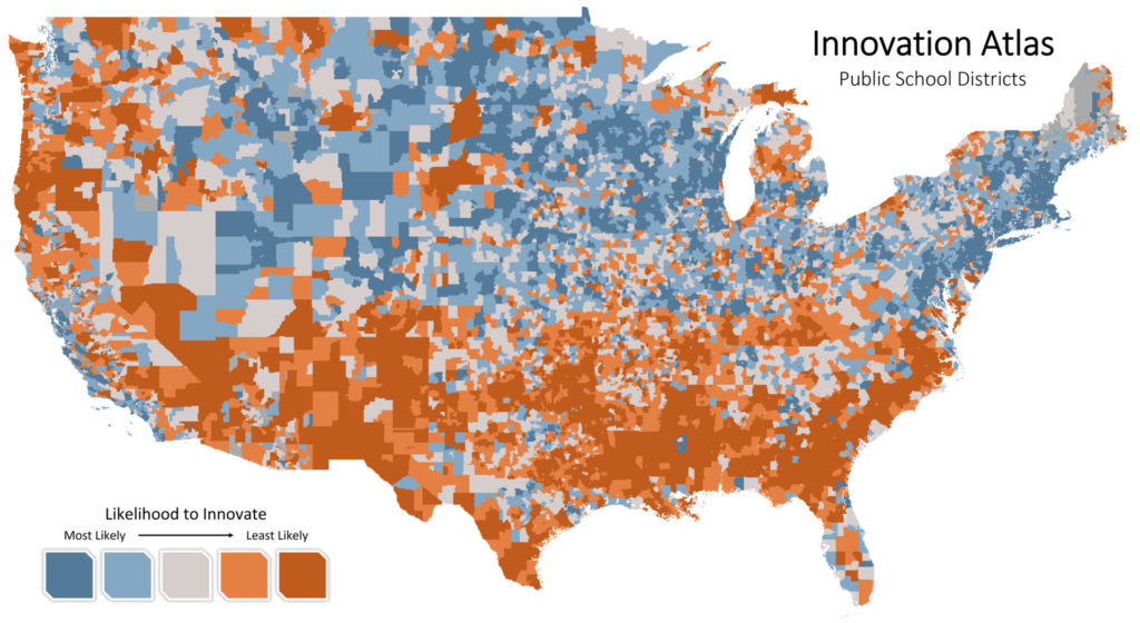
The Innovation Atlas Score is calculated using socio-economic attributes, school attributes and validated research to provide insight into where students are least likely to innovate and why these students are least likely to innovate.

Innovation Atlas

Blue Raster leveraged the flexibility and power of Experience Builder to create a "choose your own adventure” web mapping application to explore innovation potential across the U.S. Below, we list some features we configured in Experience Builder to enhance the user experience in the Innovation Atlas Explorer.

1. Informational splash window

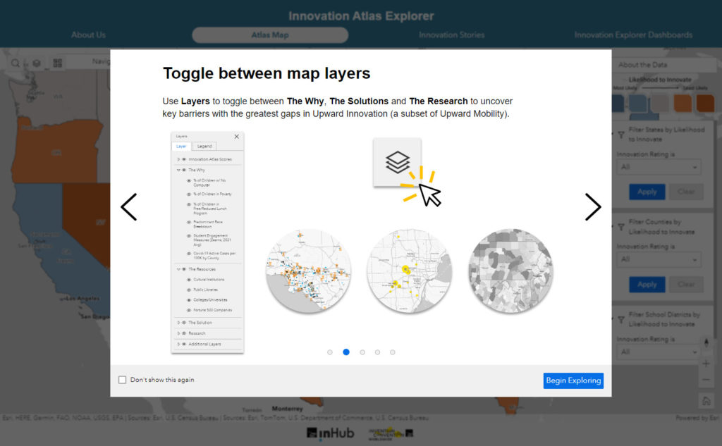
A Splash Window with a carousel template displays multiple informational slides on how to navigate the Innovation Atlas. This helps users get acquainted with the web map prior to exploring it. 

Splash Window

2. Customized filters

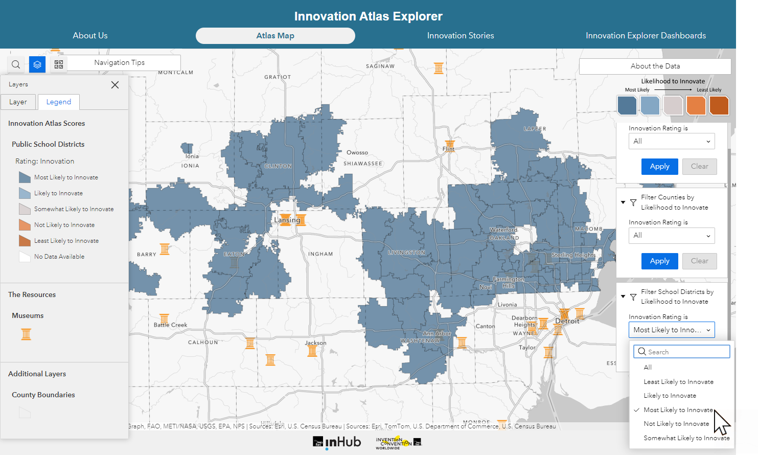
Customized filters allow the user to explore various levels of innovation potential across three geographic levels – state, county, and public-school districts. This helps users gain insight into the spatial patterns of innovation potential across the country. 

Filters

3. Access multiple apps under a single "roof"

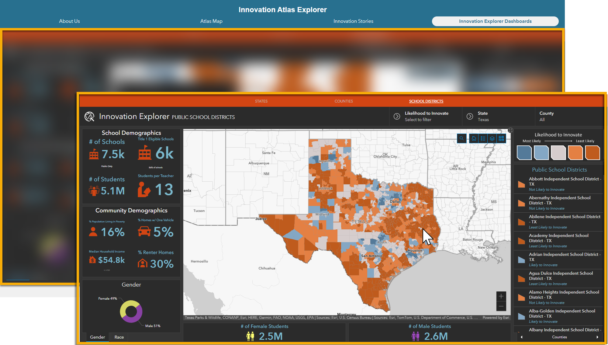
The Innovation Atlas holds a set of nested ArcGIS Dashboards that are easily accessed through the Innovation Atlas menu bar. The Innovation Atlas features a variety of map layers to explore along with innovation data. These dashboards are embedded within the Experience Builder app in a page separate from the main web map. For The Henry Ford, it was important to feature all apps under a single web app URL.

Innovation Atlas

4. Make room for valuable "non-map" information

Incorporate information such as your organization's mission and background, data methodologies, and more. Experience Builder allows for flexible, customizable pages with different media types, such as: text, images and infographics, embedded videos, and more. Pages can be created and hidden for future use, allowing content to be displayed or hidden as needed through the lifecycle of the Experience app.

Non-Map information

Contact us today to learn about The Innovation Atlas project and how we can help your organization tell your story!

Improving Deforestation Risk Management in Commodity Supply Chain

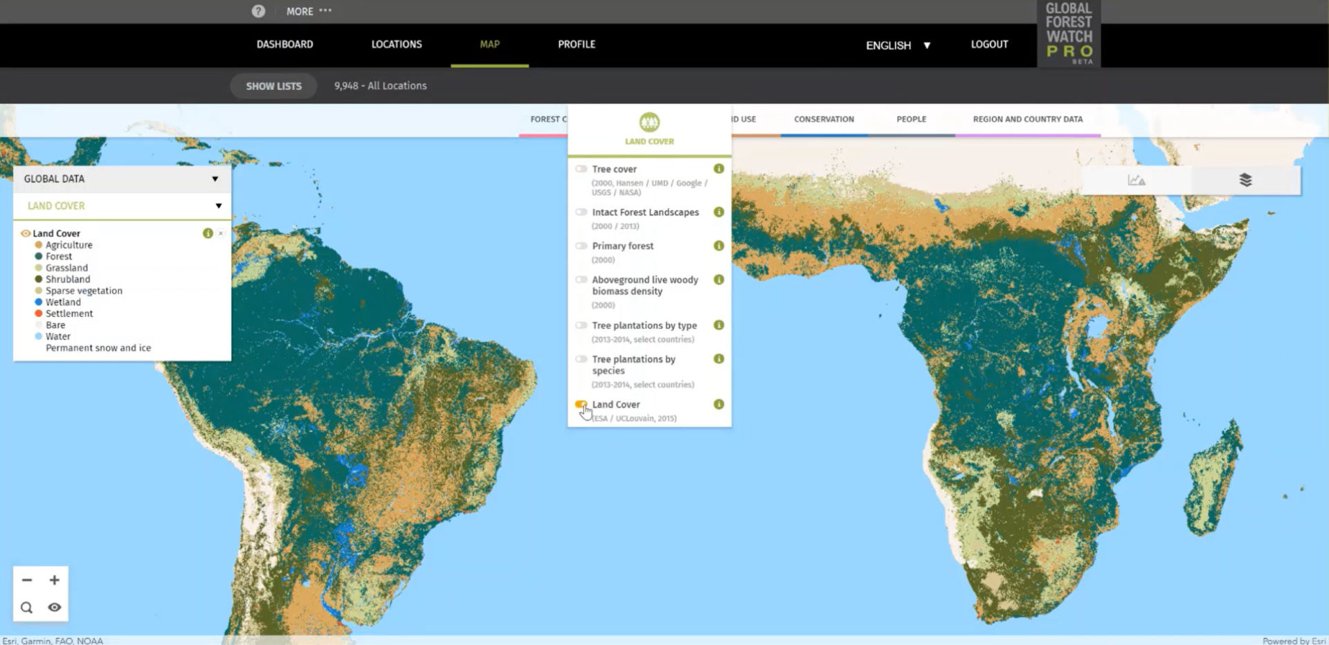
Blue Raster developed Global Forest Watch Pro, a decision support tool that empowers companies to monitor their supply chains for responsible environmental practices. Companies can upload all of their of sourcing areas, farms, and supply sheds for analysis and view interactive maps and diagnostics displaying occurrences of deforestation, alerts for forest fires, land cover types. The site now serves nearly 1,000 users across approximately 350 organizational accounts. Current users are spread across every continent in the world.

GFW Pro map

To support the growing use, Blue Raster recently implemented several updates. The analysis back-end is modernized to make it more scalable and provides more power for processing data faster. The team also moved to a Spark engine and incorporated an AWS Step workflow to allow for higher data processing capacity and improved functionality for the tool.

Promoting Sustainable Forestry Practices with High Resolution Imagery

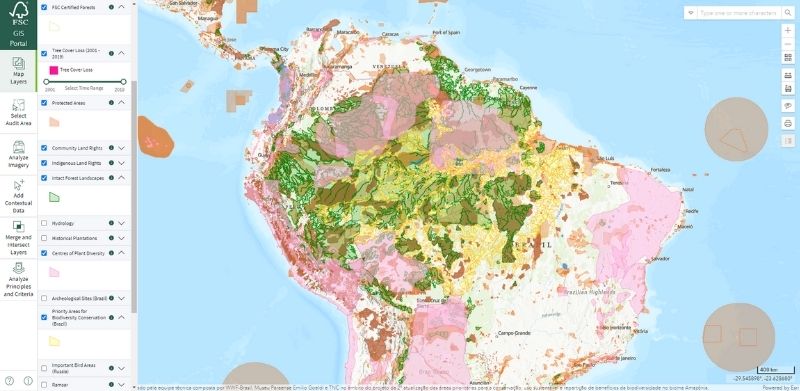
Blue Raster is proud to have developed and supported an audit area tool for the Forest Stewardship Council (FSC). This solution pulls data so that auditors can examine historic and current tree cover before going on site to complete their inspections. Now it’s available with high resolution imagery!

Blue Raster recently integrated high resolution satellite imagery from Planet and Sentinel into the audit area tool. This new imagery, made available by Norway’s International Climate & Forests Initiative, provides 3-meter resolution as compared to the pre-existing 10-meter resolution type used in the tool. This new level of detail in images provides an even clearer picture of forestry practices and realities.

FSC Sustainable Forestry Practices imagery

In addition to the new imagery, the team also updated and reorganized the layer panel to make the maps more user friendly. New tools that measure elevation changes were also added.


Learn more about this project here.


Page 4 of 32