Filter

City of Boston Zoning Viewer for Urban Planning

View planning and zoning information for properties across the City of Boston with the Boston Redevelopment Authority’s (BRA) new Boston Zoning Viewer. With the help of Blue Raster, this interactive web-mapping application was redesigned and updated with new data to assist city staff and the public in locating and determining zoning information for Boston land parcels.

Zoning Viewer Map Sample

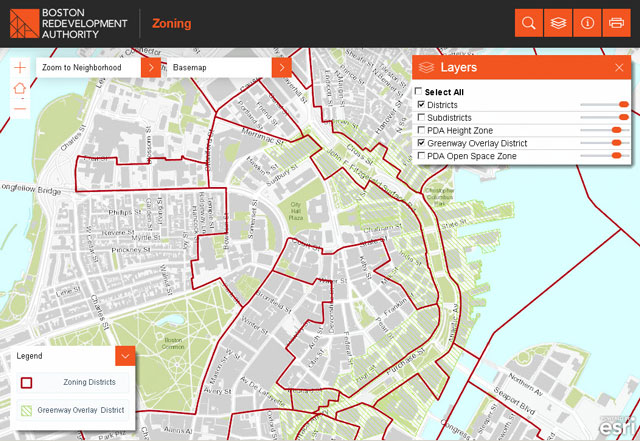
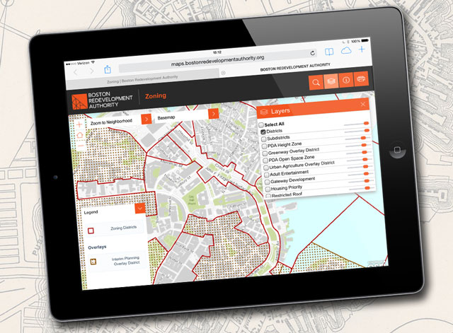
Recognizing the need to build a tool that works across multiple platforms, Blue Raster worked to optimize the application (for the first time) on mobile devices in addition to desktops. The mapping tool was successfully migrated from Flex to JavaScript and uses the latest version of ArcGIS for Server.

Boston Zoning Goes Mobile

ArcGIS Image Extension serves imagery, and with the Zoning Viewer, both the public and city staff can access parcel information including address and owner, as well as many other contextual layers including zoning districts, smart growth, transit corridor and urban renewal.

Zoning Viewer Detailed Sample

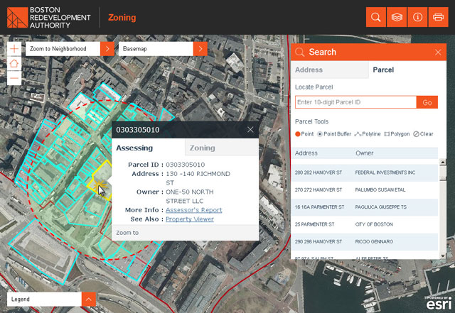
For the first time, the new Zoning Viewer is available on tablets and phones. Users can select a parcel from the map, or locate a particular parcel by typing an address into the navigation search bar. The application also supports geo-searches with line-and-polygon buffer-selection tools.


Carolyn Bennett
This application greatly simplifies our ability to get at critical zoning information combined with other GIS data.
-Carolyn Bennett, Boston Redevelopment Authority GIS Manager


Staff and the public now have current information at their finger tips to make more informed planning decisions. Visit and explore the Boston Redevelopment Authority Zoning Viewer tool today.

APTA Maps American Public Transportation with ArcGIS

Blue Raster has always been a big fan of public transportation. Our office is strategically located across the street from the CourtHouse Metro stop. When the American Public Transportation Association (APTA) asked us to build a national map of public transportation for their members, we were excited to participate in their mission of ensuring public transportation accessibility to communities across the country.

APTA Maps

APTA set out to create an interactive map to provide their members with an advocacy and outreach tool to educate public and elected officials about the vital role of public transportation. With ArcGIS Online Accelerate solutions, Blue Raster built an interactive Industry Footprint map that leverages APTA’s ArcGIS Online subscription as their mapping and analysis tool. The map includes:

  • APTA members
  • public rail lines and stops
  • bus stops buffered to 0.25 mi
  • 2010 Census urbanized areas
  • 113th Congressional districts

By using the map, users can view transit information localized to their community, as well as to the regional and national level.

Several of the layers include custom information useful to APTA Members. This puts quick facts into the hands of APTA members, for example, the number of passenger miles traveled within a legislator’s district. Blue Raster integrated Sunlight Foundation’s Congress API v3 for complete and accurate congressional details.

APTA Maps work on tablets

Blue Raster queries a secure APTA member web service and geocodes addresses using Esri’s ArcGIS Online World Geocoder. The tool leverages the ArcGIS Online Portal API and server-side python tools to seamlessly integrate member geographic data.

The transit information is built from the General Transit Feed Specification (GTFS) data exchange. This specification defines a common format for public transportation schedules and associated geographic information. The GTFS data exchange is a site of “feeds” for public transit agencies to publish their data, and for developers to write applications that consume the data in an interoperable way. The result is a national layer of public transit in the Industry Footprint map.  Learn more about GTFS by visiting the Yay Transit! website that breaks down a GTFS feed for the ArcGIS user.

Contact us today to learn how your organization can benefit from our ArcGIS Online Accelerate solutions.


Mapping Education and Demographic Trends with MapED

The Census Mapping program at the National Center for Education Statistics (NCES) – U.S. Department of Education has just released MapED, a new online mapping platform developed by Blue Raster and partner, Sanametrix, to visualize education and census data across the country.

MapED Homepage

The platform unites NCES and CENSUS datasets with GIS mapping capabilities. The general public can investigate education and demographic trends on local, regional, and national scales. The improved workflow makes it possible for anyone to discover, map, and analyze the data with ease, as users walk through selecting a program or topic area and explore and visualize the data on customizable maps.

Initially, the platform contains school, district, and or state-level data from:

  • American Community Survey (ACS)
  • Common Core of Data (CCD)
  • Integrated Postsecondary Educational Data System (IPEDS)
  • National Assessment of Educational Progress (NAEP)
  • the Private School Universe Survey (PSS)
  • More data and programs are planned in the future.

Tai Phan, School District Demographic System Survey Area and Census Mapping Lead at NCES
“MapED is a valuable resource. The data has always been available but the ability to narrow down hundreds of Census demographic indicators over multiple years, starting out with a topic of interest; and then visualize it on a national map down to the district or school level is a new and powerful way to make it accessible to a much wider audience.

-Tai Phan, Census Mapping Lead at NCES


MapED also features a series of  Story Maps that will be released in the coming months. The initial release features Story Maps exploring school bullying on the basis of race, sex, and disability as well as public school student performance on the National Assessment of Educational Progress (NAEP) from 2003 to 2013. Future releases will include additional story maps including school enrollment by race comparisons using ACS data.

Map Ed Storymap on Bullying

MapED is developed using the ArcGIS API for JavaScript and ArcGIS Server and uses .NET web services to automate the addition of new data each year. Esri JavaScript templates and ArcGIS Online both support the development of story maps.

To learn more about the project and view the application, visit NCES MapED.

mapED-640

ED Moves ArcGIS Servers to Amazon’s GovCloud

After two years of planning and preparation, on September 15, 2014 the U.S. Department of Education’s Institute of Education Sciences (IES) successfully completed migration of its on-premises datacenter to the Amazon Web Services GovCloud region. As an Amazon Consulting Partner, Blue Raster led the effort to consolidate IES’s National Center for Education Statistics (NCES) ArcGIS servers from a hybrid on-premise/private cloud-hosted environment to their AWS GovCloud account.

AWS GovCloud

The GIS servers are built using Amazon Machine Images (AMIs) with Esri ArcGIS Server and SQL Server. These servers power the newly released MapED website, as well as the NCES’s School District Demographic System mapping application, a national survey effort that includes a GIS feature editing application to collect school attendance areas.

Designed specifically to meet the needs of U.S. government agencies, the AWS GovCloud (US) framework allows agencies, contractors, and customers to migrate sensitive workloads into the cloud while adhering to U.S. International Traffic in Arms Regulations (ITAR) as well as the Federal Risk and Authorization Management Program (FedRAMPSM) requirements.

Contact us today to learn more about migrating ArcGIS server workflows to Amazon Web Services.

Global Forest Watch Fires Story Map – An Inside Look

Global Forest Watch (GFW) recently launched a new story map highlighting the functionality behind GFW Fires, an online platform for monitoring and responding to fires in Southeast Asia. The story map walks users through the platform and explains its growing role in the fight against land and forest fires.
Global Forest Watch Fires Story Map

Created using ArcGIS Online and the Map Journal Builder, the story map is organized into eight sections that users can scroll through. Each section highlights a different feature of the platform, and tells the story behind how it is helping government agencies in Indonesia and other countries monitor and respond to fires with more precision and speed. It also explores the environmental, economic, and social implications of these fires. From Digital Globe and Landsat high-resolution satellite imagery to wind and air quality data, the platform empowers people to combat these fires before they burn out of control and enables greater accountability where crimes of illegal burning may have been committed.

map showing air quality monitor data

To learn more about GFW Fires and how you can get involved, check out the GFW Fires Story Map and the GFW Fires platform today.


Page 51 of 66