Our Work

Blue Raster helps you tell your story through interactive
mapping technology. Make your message clear, exciting,
and user-friendly for both mobile and web platforms.

Filter

Modeling a Decision Support System in Response to COVID-19

We are proud to work in partnership with the Space Enabled Research Group at the MIT Media Lab and East Carolina University in developing a decision support tool that can inform public policy in response to challenges such as the COVID-19 pandemic.

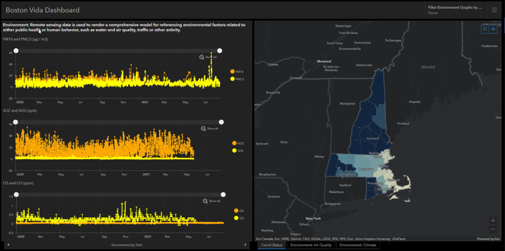
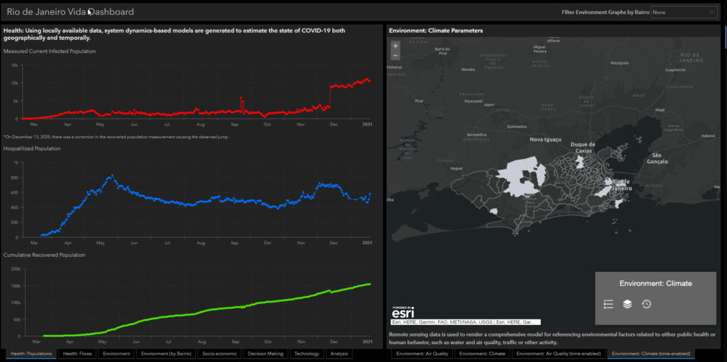
The Vida Decision Support System is a customized online tool designed for use by public sector officials at the city and regional level who are making policies regarding public health, the economy, or environmental management. The Vida Decision Support System helps city and regional leaders understand the relationships between important societal factors. The tool is built on a framework that uses a series of models:

  • Environment
  • Socio-Economic Vulnerability
  • Public Policy and Decision-Making
  • Technology Design

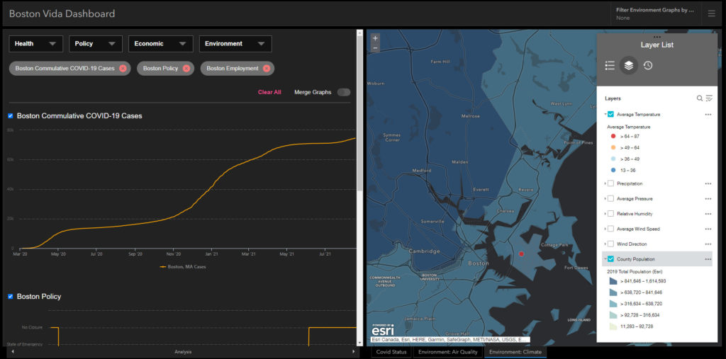
Vida is based on an integrated Data Visualization and Modeling Framework created by the Space Enabled research group at MIT that combines multiple data sources and creates simulations of the current or potential future states of a city or region.

This tool is being developed in partnership with several government entities including Angola, Brazil, Chile, Indonesia, and Mexico. The tool was developed using ArcGIS Dashboards. The “Analysis” tab includes an embedded data comparison tool developed in JavaScript.

Beyond COVID, this tool can be applied to any number of disruptions including drought and extreme weather events, as well as helping to meet sustainable development goals.


Automating Workflows for COVID-19 Response

Saratoga

Saratoga County is one of the fastest growing counties in upstate New York. The Department of Public Health has a robust COVID-19 dashboard that keeps businesses, policy makers, schools, and the general population informed of the rate of cases and hospitalizations. Using a New York State Department of Health emergency funding Coronavirus Response grant, the county partnered with Blue Raster for support with automating workflows and deploying ArcGIS Enterprise.

automating workflows

The Blue Raster team worked with the Department of Health to automate their daily data publishing process through ArcGIS Notebooks. Notebooks are an efficient, modern environment that combine code, on-the-fly visualizations and maps, as well as data tools. In the notebook editor, you can write, document, and run Python code in one place. This helped with automating workflows reduced the time spent each day updating the dashboard.

Blue Raster is also supporting the installation and configuration of a base deployment of ArcGIS Enterprise to support the expanding use of ArcGIS. We’re here to serve any state and local organization looking to better utilize their data.

Esri State and Local Specialty

Support for COVID-19 & Emergency Response

Blue Raster is ready to assist your organization with the rapid setup of Operations Dashboards and ArcGIS Hub pages for Covid-19 response efforts. Trained by Esri & FEMA on disaster response efforts, our team is experienced in quickly developing innovative and clear dashboards and sites that present crucial data in an easy-to-understand and consumable format, which allows for decision makers to view and assess current situations and guide informed decision making surrounding Coronavirus.

Operations Dashboards

  • Rapid setup of dashboards tracking Coronavirus and Vaccination data
  • Detailed and easy to consume data on Social Distancing efforts
  • We can quickly configure and deploy dashboards for an organization's internal and external use. As a result, State and Local agencies can also use these dashboards as a collaboration tool to aid in COVID-19 decision making.

ArcGIS Hub

Blue Raster offers Hub support packages to help users successfully set up, implement, and launch ArcGIS Hub. Using our technical expertise and comprehensive knowledge of ArcGIS Hub configurable templates, Blue Raster can help you jump start your Hub Apps and Initiatives.

  • Rapid deployment of key metrics and community information surrounding COVID-19
  • Communicate recovery initiatives for essential and non-essential businesses, keep citizens informed and aware of response efforts and the latest updates
vaccine

Vaccine Distribution

  • Identify facility candidates
  • Identify and prioritize populations
  • Determine gaps in access
  • Manage vaccine inventory
  • Public outreach and communication
Contact tracing

Contact Tracing

Adding location to contact tracing can help slow down the spread of COVID-19 by increasing awareness and enabling quick preventative action.

  • Connect case investigation and contact tracing
  • Visualize how many Case interviews are performed, how many Contacts have been tested and how many are positive, and how many positive Contacts can be directly linked to a Case or a place
  • Survey for regular health checks
  • Spatial analysis to assist with making connections among locations of the disease, affected individuals, and nearby available resources

StoryMaps, Apps, and Dashboards

Our team helps government agencies and non-profits tap into the power of using story maps, dashboards, and apps for COVID-19 communication and resources.

  • Internal and external dashboard visualizations for tracking cases, tests, deaths, and other metrics
  • Data automation and integration
  • UI/UX design support including meeting accessibility standards
Maryland-Dashboard
MD-Hub

Public Outreach

Leverage ArcGIS Hub sites to involve and update the community, predict virus surge, and communicate important information around vaccine distribution and phased openings. As an ArcGIS Hub Specialty Partner, Blue Raster can help you jump start your Hub Site and tap into the power of Hub's community engagement platform.

  • Communicate recovery initiatives for essential and non-essential businesses
  • Keep citizens informed and aware of vaccine sites and the latest updates
  • Provide information on local resources provided by your city or state

Example Projects

Esri UC Map Gallery

To illustrate what the Red Cross' response efforts look like during times of COVID-19, the Red Cross collaborated with Blue Raster to publish a StoryMap.

During the coronavirus (COVID-19) pandemic, life’s emergencies don’t stop — and neither does the work of the American Red Cross

Visit the StoryMap to learn more about the Red Cross' mission, relief efforts, opportunities and more.

1611865473196

Collin County, Texas

Vaccine Distribution & Hot Spot Analysis

In order to view trends and highlight recent change over time in various parts of the County, Blue Raster analyzed differences between COVID-19 cases for multiple two-week intervals.

Additionally, in efforts to visualize the County's key vaccination distribution metrics and trends our team deployed Esri's ArcGIS Solution: Coronavirus Vaccine Distribution Dashboard.

calaveras-county-portrait

Calaveras County, California

COVID-19 Dashboard

To help communicate the County's efforts around vaccine distribution, Blue Raster is currently collaborating with the County on a Vaccine and COVID-19 Hub Site. The site will include key vaccination distribution metrics and trends and will utilize tools included in Esri's ArcGIS Coronavirus Vaccine Solution.

FEMA Hub 2

FEMA

ArcGIS Hub

Blue Raster collaborated with Esri and FEMA to design a Hub site for data sharing and collaboration among FEMA's partners. While not public, the site can be accessed by all of FEMA’s federal, state, local, tribal, private sector, and NGO partners.

logo.png

York County, Pennsylvania

Vaccine Information ArcGIS Hub

To help communicate the County's efforts around vaccine distribution, Blue Raster is currently collaborating with the County on a Vaccine and COVID-19 Hub Site. The site will include key vaccination distribution metrics and trends and will utilize tools included in Esri's ArcGIS Coronavirus Vaccine Solution.

starkhealthdepartmentwithouttagline.jpg

Stark County, Ohio

Case Monitoring

Blue Raster supported Stark County, Ohio with case monitoring efforts to enable patients diagnosed with COVID-19 to electronically self-report. The workflow leveraged ArcGIS Hub Premium, ArcGIS Dashboards, and Survey123 technology.

Response Support for States

Our team continues to work with state agencies to help with response and recovery efforts. Our team has had the privilege of supporting over ten agencies including Georgia, Louisiana, Texas, Maryland, and Nevada.

Need help? Contact us to get started today.

If you are a state or local government agency, we are on the GSA Schedule as well as many state contracts, like eVA, Maryland CATS+ and Pennsylvania Disaster Emergency Suppliers. Additionally, we are on many state & agency COVID-19 response vendor lists.

gsa.png?ver=1.0.0

Contact Form

  • This field is for validation purposes and should be left unchanged.

StoryMaps in the Time of COVID-19: Telling the Story of the Red Cross Response Efforts

While a large portion of the country and world is doing its part to stay indoors during the coronavirus (COVID-19) epidemic, organizations like the American Red Cross continue to provide disaster relief. What do these efforts look like during times of COVID-19? To highlight these efforts, Blue Raster collaborated with the Red Cross to publish a new story map: How the Red Cross is Helping During COVID-19.

The goal of the story map is to showcase how the Red Cross has shifted its operations while continuing to fulfill their lifesaving work to alleviate suffering despite the pandemic. Additionally, since the coronavirus disease impacts different regions in different ways, the story map highlights what COVID-19 relief missions look like across the country. Just as important, it provides the reader with resources for how to help.

Red Cross StoryMap Details

To portray the significance of the Red Cross’s efforts, Blue Raster leveraged ArcGIS StoryMaps platform. We were excited to configure the new Navigation bar. This allows the read to skip the scrolling and jump to a section of interest. The new floating panel layout for the Sidecar allows the featured photos to tell more than a thousand words. In addition, the Express Map helps highlight the geographic breadth of the Red Cross’s COVID-19 response. Thanks to the photos provided by the Red Cross, the story map provides an intimate look into the interactions between the Red Cross relief teams and those being assisted during a time of strict distancing. View the full Red Cross StoryMap here: How the Red Cross is Helping People During COVID-19

In times of COVID-19, Blue Raster prioritizes helping organizations like the Red Cross tell their story in a meaningful and impactful way. Learn about COVID-10 Response efforts using ArcGIS. We are ready to assist your organization with the rapid setup of ArcGIS platforms that best suit your needs, such as Operations Dashboards, ArcGIS Hub, and Experience Builder, and more.

Contact us today to learn more about how we can assist your organization.

Contact Us

  • This field is for validation purposes and should be left unchanged.

COVID Response Dashboard

Over the past few weeks Blue Raster has been working to assist State and Federal Government agencies in the response to the COVID-19 outbreak. Providing a means to present accurate, up to date data to the public is essential to the success of mitigation efforts across the country. Blue Raster has been actively working to create Esri Operations Dashboards to do exactly that.

Virginia COVID-19 Social Distancing Dashboard

With Operations Dashboard for ArcGIS Online, Blue Raster created an interactive COVID response dashboard using Johns Hopkins University’s county level COVID-19 case data and Unacast’s Social Distancing Index to present crucial data in an easy to understand and consumable format. By using this data in a map-centric dashboard format with relevant figures, it allows for decision makers to view and understand the current situation and guide informed decision making.

Johns Hopkins COVID-19 dashboard has been used globally to track the spread of the Coronavirus outbreak since it was first recognized in early January. In the past weeks, the University has been able to release more granular county level data for the United States to improve tracking of the virus. The JHU county level data updates often with the latest case reporting from across the country.

Unacast’s Social Distancing Index, now available as a dataset in the Living Atlas and as a standalone map viewer application hosted by Esri, aggregates the average travel distance of residents in a county and their average visitation to non-essential locations. Additionally, it assigns each county in the US a letter grade to represent how well its residents are adhering to the CDC Social Distancing Guidelines.

Customizable Dashboard Template

The decision to use publicly available data allowed for the rapid turnaround of personalized dashboards for the state of Nevada and Virginia based off of the same core datasets available in the Esri Living Atlas. Key information from these datasets are then presented in an easy to understand operations dashboard to summarize the current situation of a state. This has also allowed Blue Raster to create a template based off of these dashboards. We can quickly configure and deploy this template for an organization's internal and external use. As a result, State and Local agencies can also use these dashboards as a collaboration tool to aid in decision making.

Ready to find out more?

Contact us today to get started on your own COVID response dashboard.


Page 1 of 3